Set Design
This was a very exciting thing to work on personally as for the most part, the sets I had been on during my university career had been quite minimalistic - whether as stylistic choice or just a consequence of online uni.
Our Design Ideas
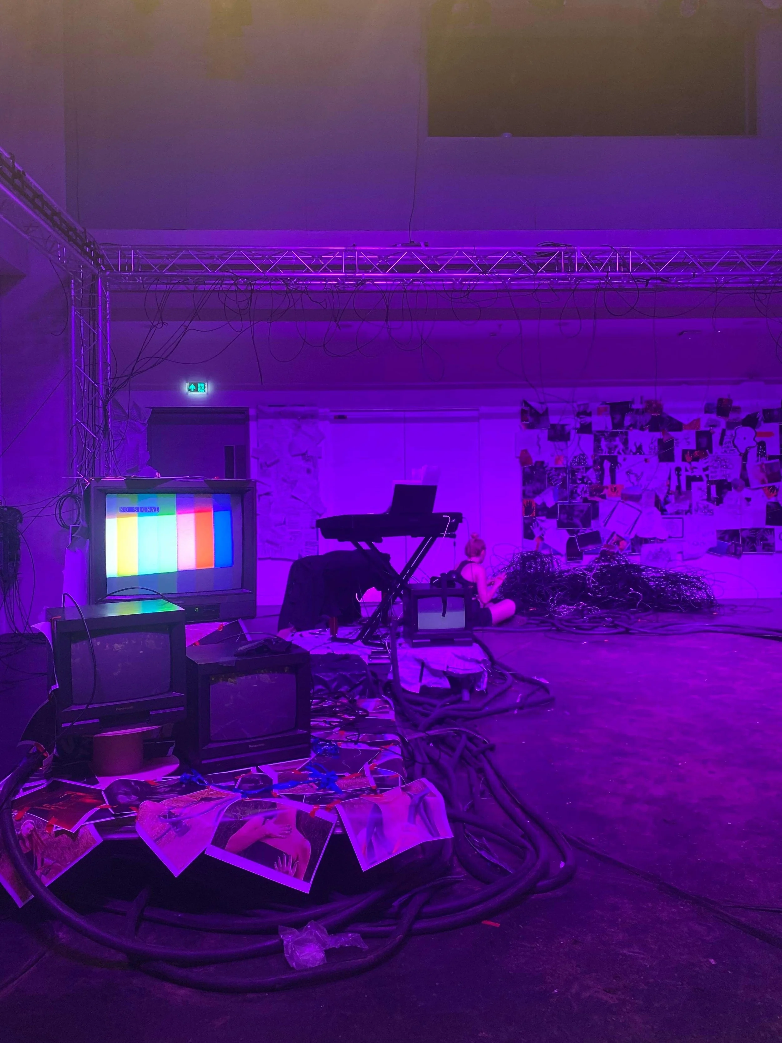
Quite early on, we had decided as a group to do something with wires after a discussion with Kevin. I had been using CRT monitors in my exhibition and I like exploring nostalgic aesthetics in my work so was drawn to that when we wanted TVs to show the films - I found it especially relevant since we were setting it in a wire filled wasteland which I think would have benefitted with having “obsolete” and dated technology in the sea of wires.
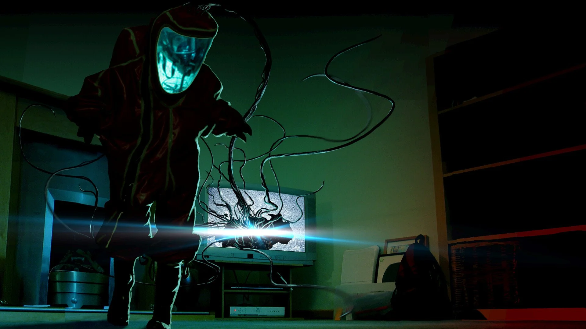
Becca liked the idea of having a broken TV with a tangle of wires inside of it, as well as having LED strips in it to make the TV emit a glow which I found interesting as it had very much reminded me of an image I had found when I was drawing design inspiration (Await Further Instructions)
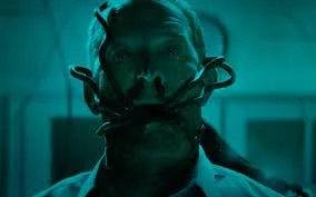
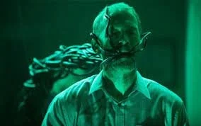
I quite loved the idea of having calcified bodies in the space, inspired largely by the bodies found in Pompeii that were frozen as they were by the pyroclastic flow. I felt this also fed into Jake’s idea of reward and punishment - the scattered body parts implying a punishment for previous inhabitants of the space.
Design Inspiration
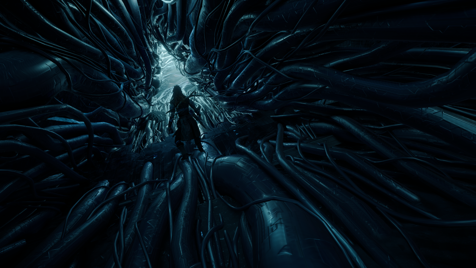
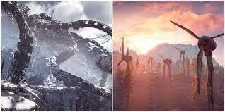
HORIZON ZERO DAWN (2017) & HORIZON FORBIDDEN WEST (2022)
Horizon Zero Dawn (HZD) is a video game for PlayStation 4 set in a post apocalyptic America after robots that use biomass for fuel overrun the planet and decimate mankind. 1000 years later with the help of AI Gaia designed by Dr Elisabet Sobeck, nature is once again restored and flourishing maintained by machines resembling animals.
The elements of the game design I was particularly drawn to is the struggle between the natural and artificial. Manufacture takes over and destroys nature with the FARO robot plague, but then later nature overtakes it all - like vines taking over abandonned buildings.
I rather liked the idea of the inclusion of vines and moss as it makes the audience ponder whether we’re witnessing manufacture take over the natural world or if we’re seeing life beginning to blossom again.


Design Inspiration
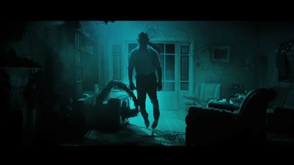
AWAIT FURTHER INSTRUCTIONS (2018)
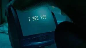
Await Further Instructions is a sci-fi horror movie. On Christmas Day a family wake up to find mysterious black cables surrounding the house and trapping them and their TV broadcasting one message: “Stay Indoors and Await Further Instructions”.
One element I particularly liked was the fact the cables seemed sentient and were destroying on their own volition.
When looking at stills and other images from this film to add to my moodboard I stumbled across some of the concept art which reminded me of an idea Becca had had about there being wires in the TV, but instead of it being an animation, these were literal wires coming out of the TV. Later, the idea developed into literal wires in a hollowed out TV carcass (which were available from the prop store) and we discussed using LED strips amongst the wires to imitate the eerie glow, not too dissimilar from the concept art below.
This viewpoint design wise for me adds an interesting layer on how we percieve the actions on stage - whether it was the Controller who was destructive or whether it was the wires. How much free will do they actually have or are they being controlled by the wires like puppets controlled by string?
Design Inspiration
MARC AUGÈ
“Place” is created by two key elements – location and time, therefore by that very definition, a non-place must be the antithesis of this, either lacking a concrete anchoring to location or time period. Marc Augè in “Non-Places: An Introduction to Supermodernity” sets out his parameters for what constitutes place in a similar way, particularly focussing on the time aspect of this stating that it must refer to either “an event, a myth or a history”. (Augè, 1995:67)
“If a place can be defined as relational, historical and concerned with identity, then a space which cannot be defined as relational, or historical or concerned with identity will be a non place.” (Augè, 1995:63)
Non-Places gave me a theoretical viewpoint to shape and influence my views on set as world building rather than getting sidetracked by just aesthetics. I had to keep in mind transforming the set from being a space decorated a certain way where our play happens into being almost like a pocket-dimension of sorts.
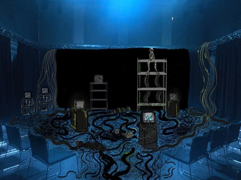
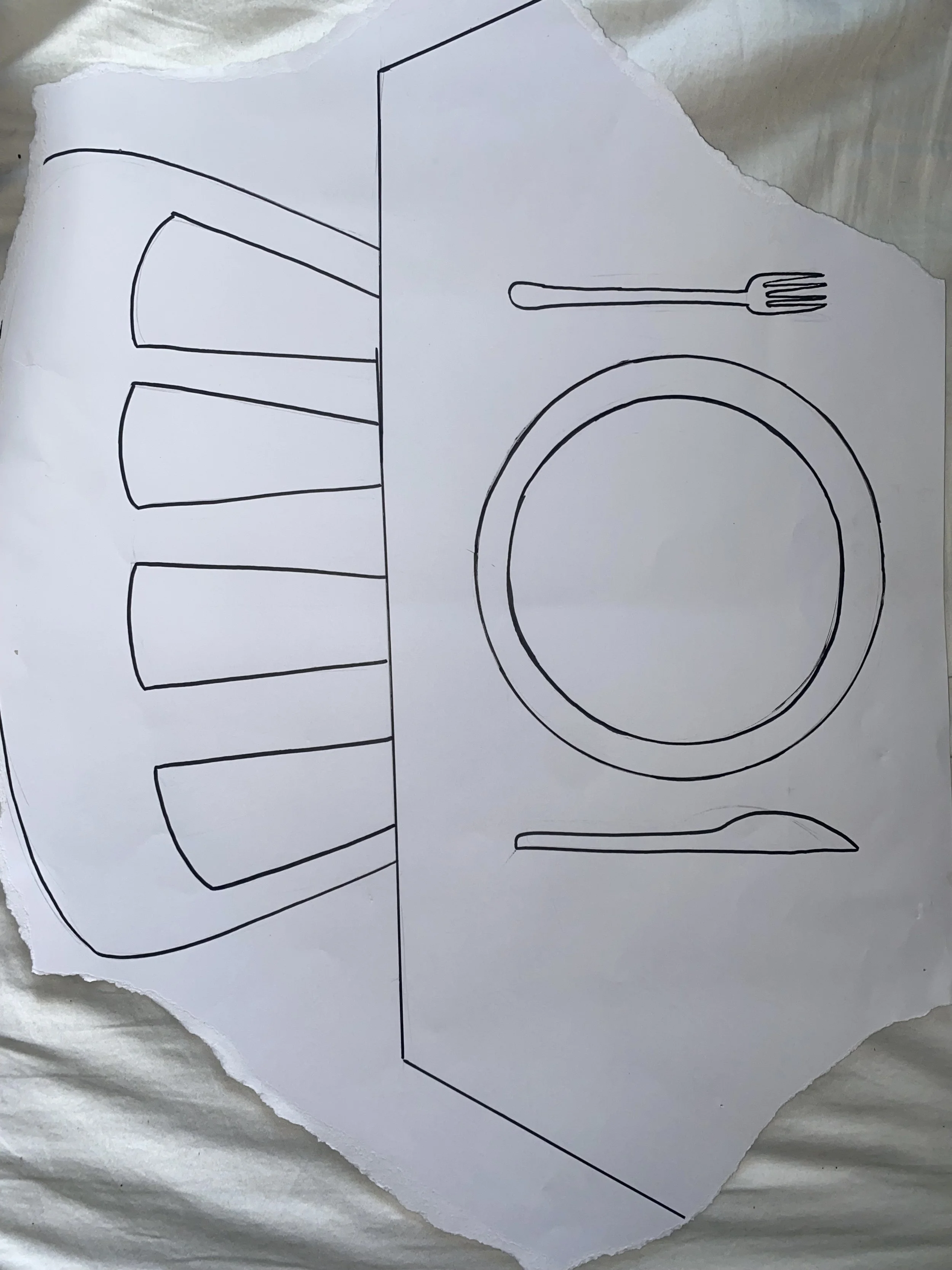
Propositions
Myself, Amy and Becca presented the group with the following proposed set designs pointing out particular features, discussing materials, possible budget issues and ways we’d try to circumvent it.
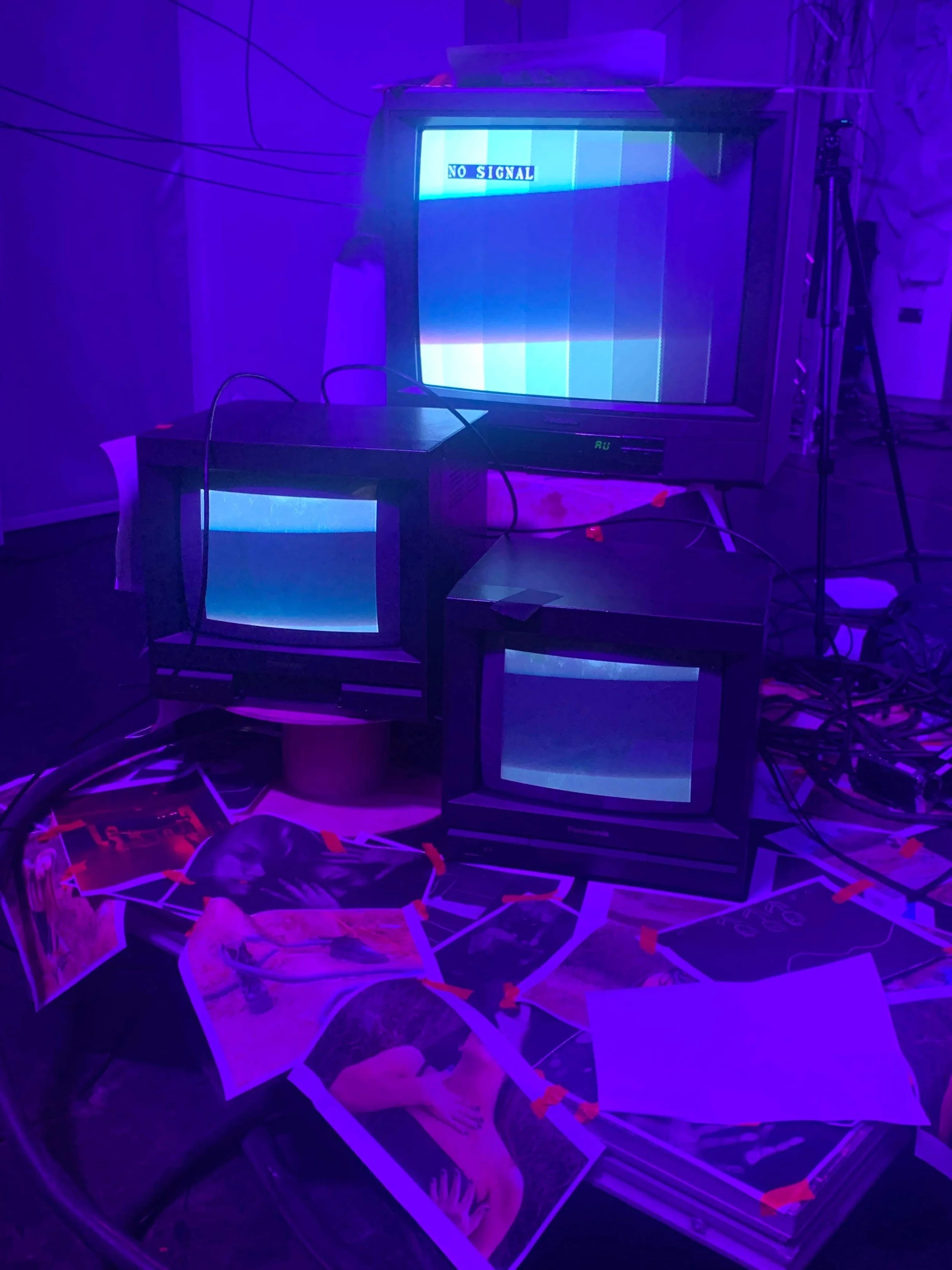
A key design aspect is the CRT (Cathode Ray Tube) monitors - a type of monitor which were first commercially available in 1934, falling out of fashion in the 2010s with the emergence of LCD, LED TVs - both of which were less power hungry and much less bulky than the CRTs.
I was extremely eager to use these and in my mind, felt it was important in the depiction of time.
Given that The Operator’s desk, with it’s flat screen monitors and laptops are all visible (and visibly in use) to the audience, I believe that it does help create a time vacuum. If the CRTs were all broken and defunct but the modern technology is in use, then the landscape must be a modern junkyard. If the CRTs were the only things in the space working, then perhaps we’re further back in time. The inclusion of more archaic and modern technology isn’t enough - they have to be seen by the audience as functioning to help create that weird time vacuum.
After some tweaking and merging of ideas, we settled with this final design.
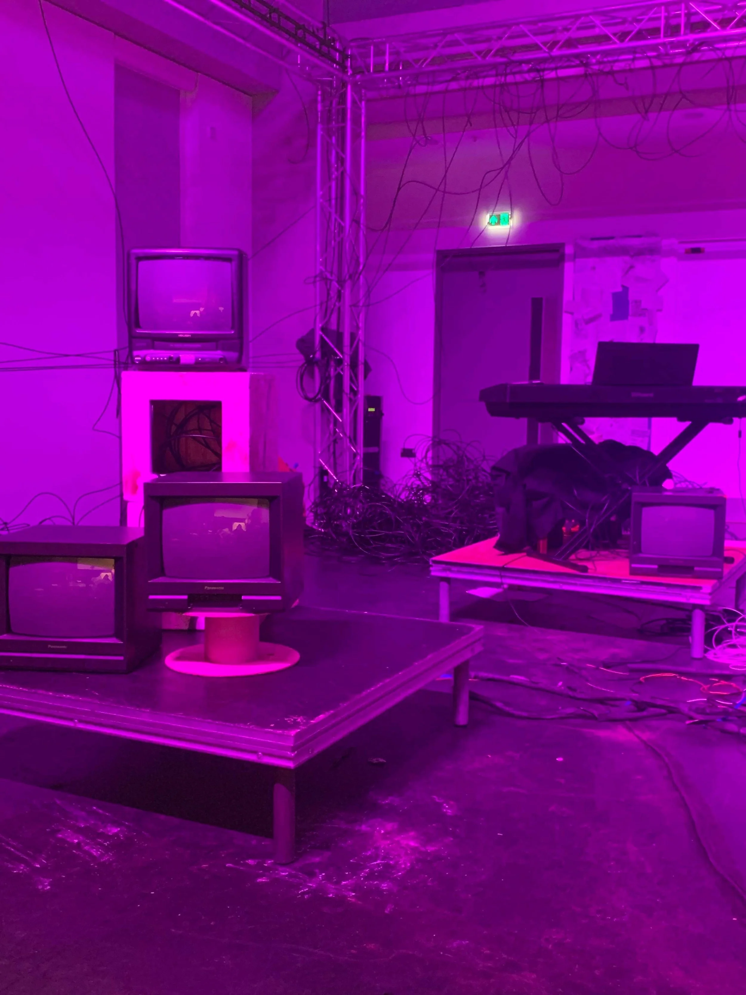
As we went further along with the process, Jake decided he would like the audience and performance areas switched round as there’s a lot of activity in the cupboards/by the doors and he wouldn’t want the audience craning their necks every single time which was logical. This meant we had to get the technicians to adjust the lights and also presented us with a new problem - the back wall (that the curtains do not cover).
Many solutions were offered up such as hiding them with stage flats (too bulky, gaps between them) or with fabric (hard to stick to wall, extremely expensive to get a material opaque enough and large enough to cover everything).
In the end, it was proposed we tack images, drawings, sheet music and other items to the wall and create a tapestry of sorts:
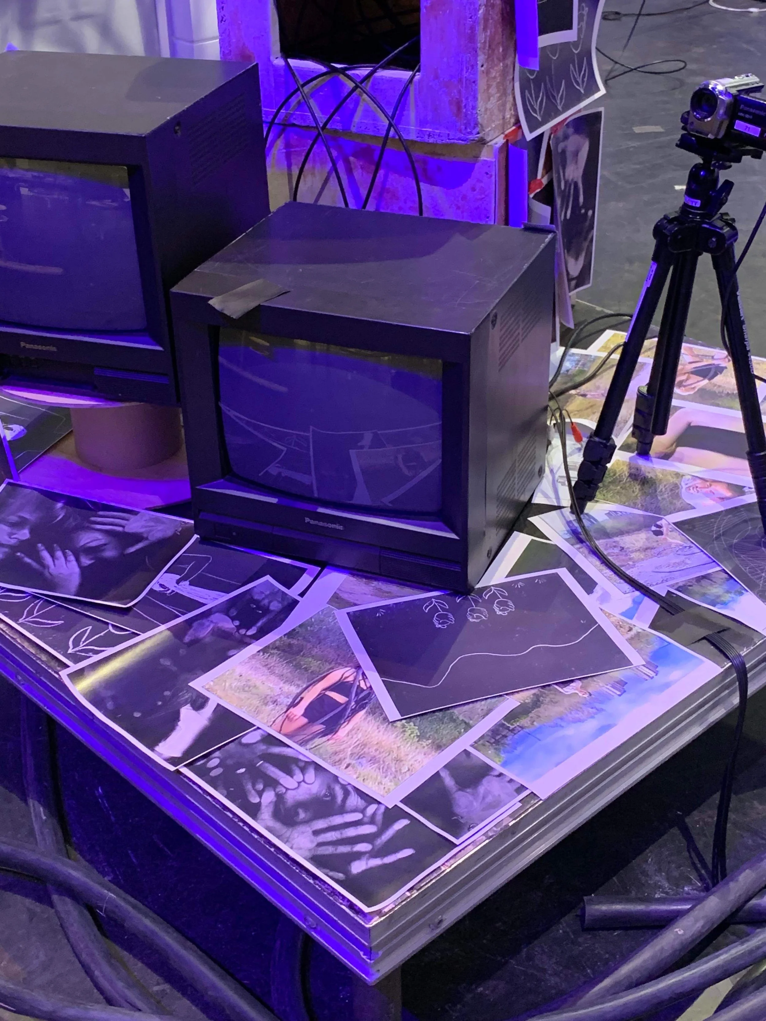
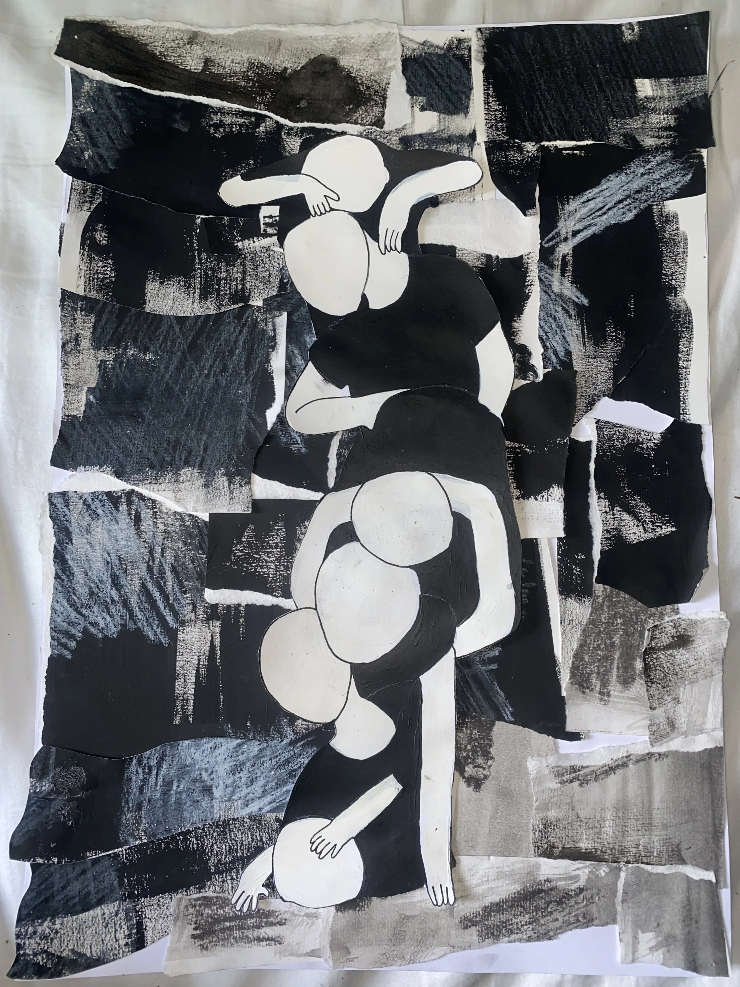
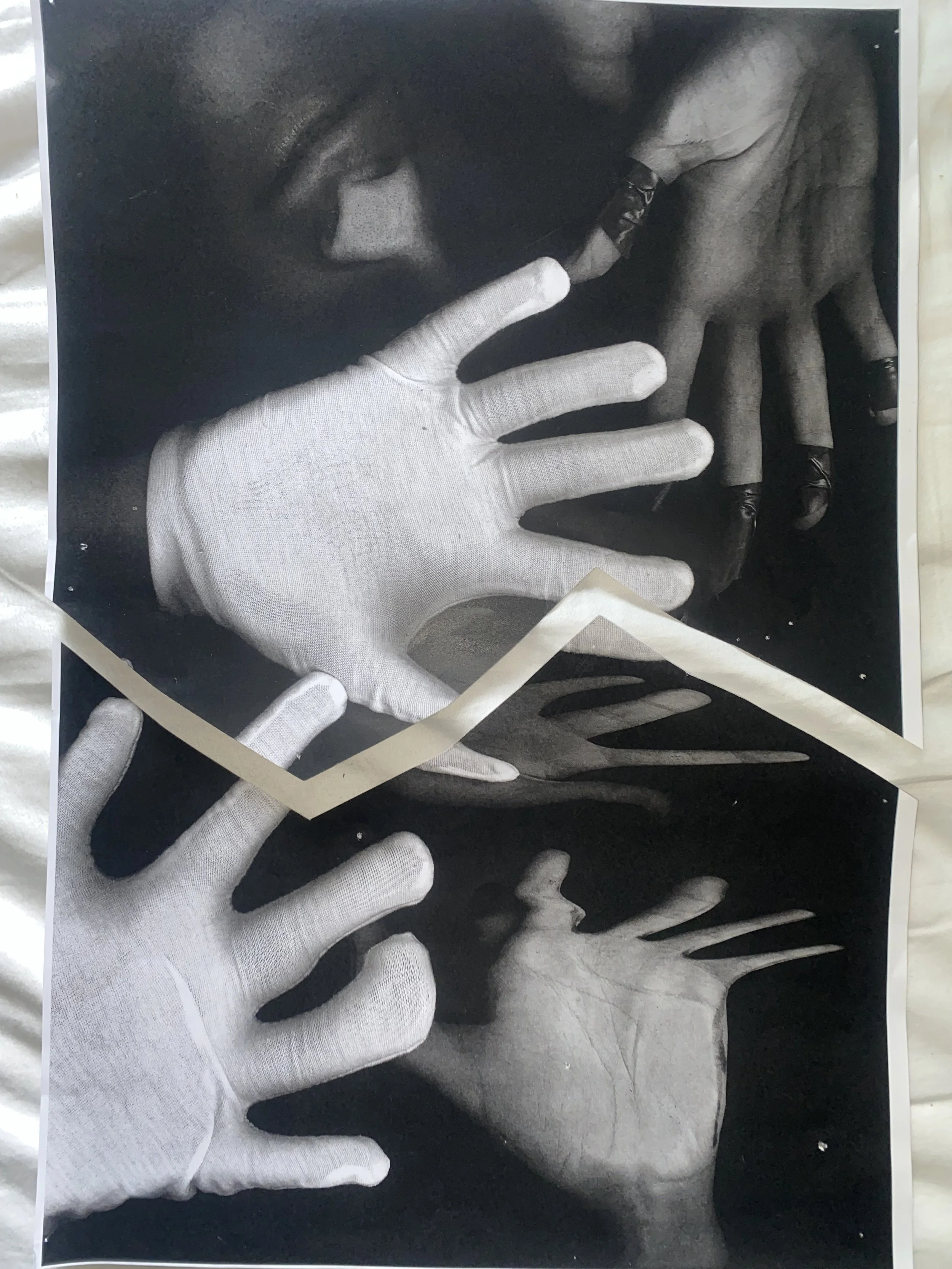
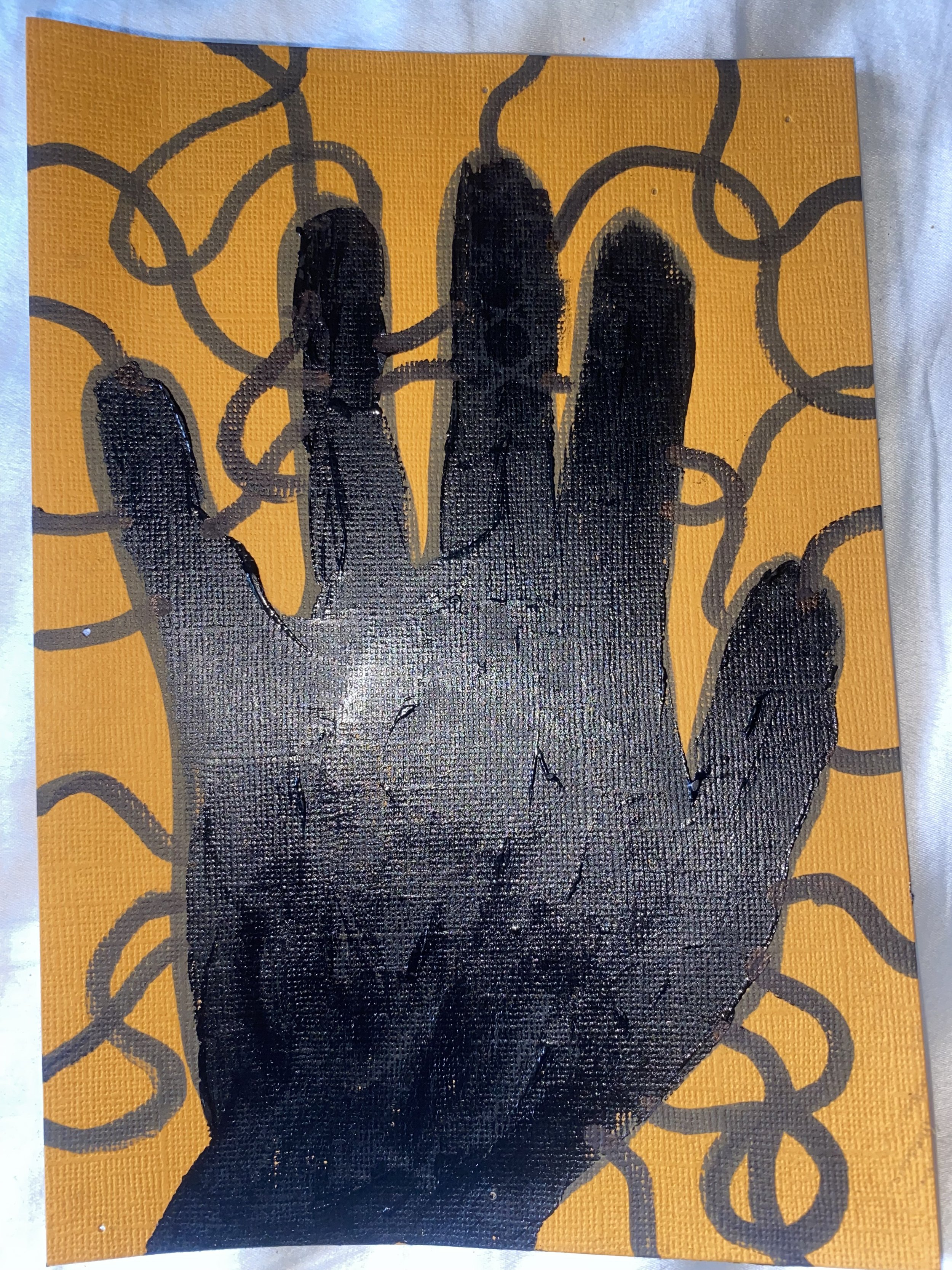
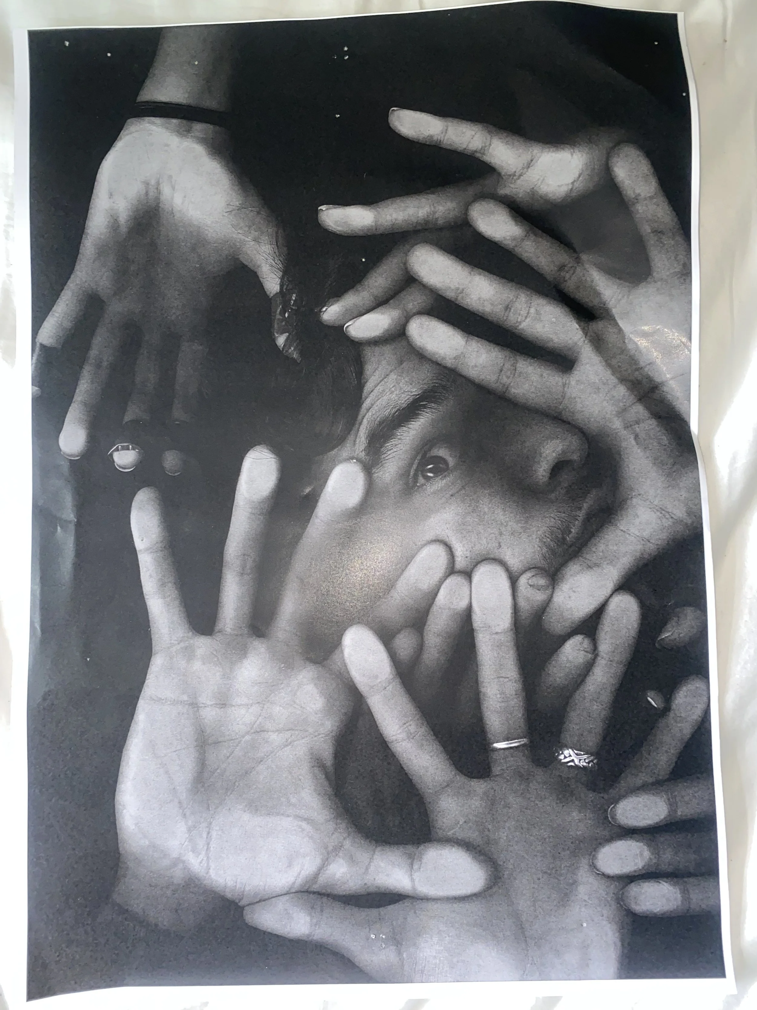
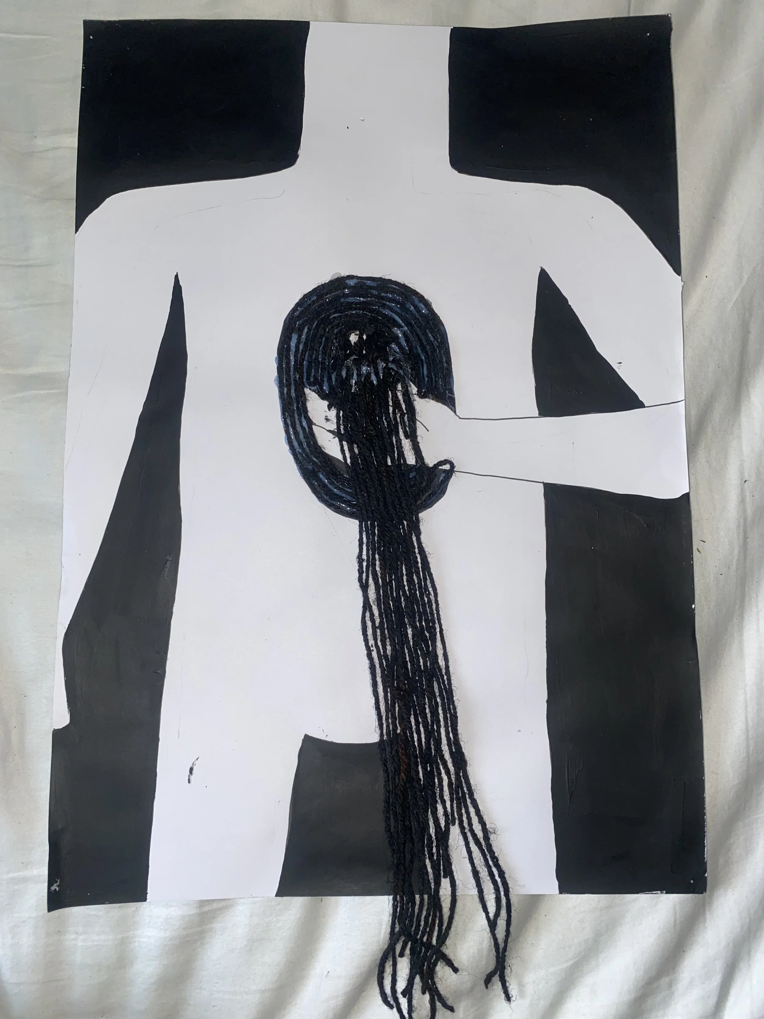
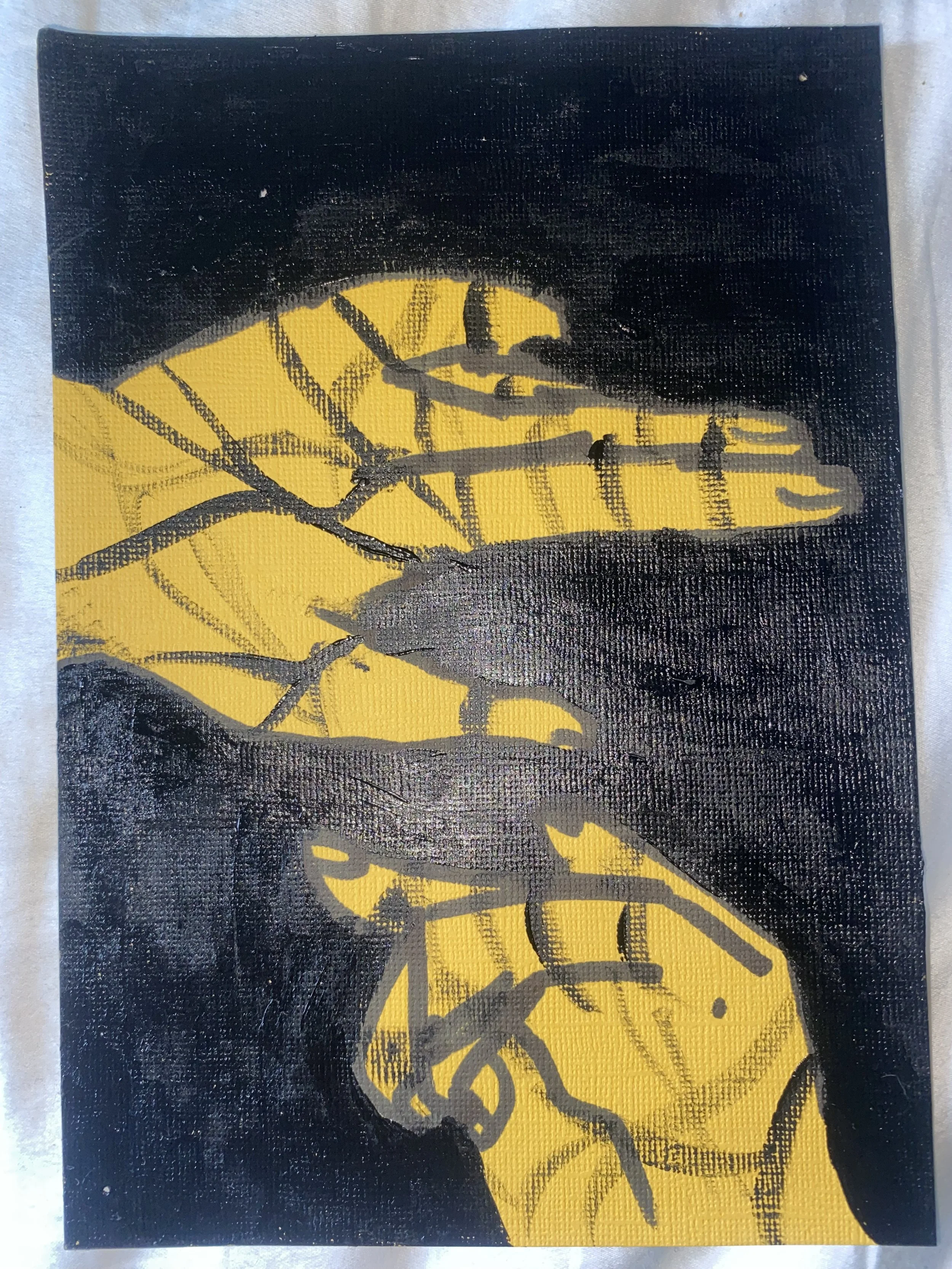
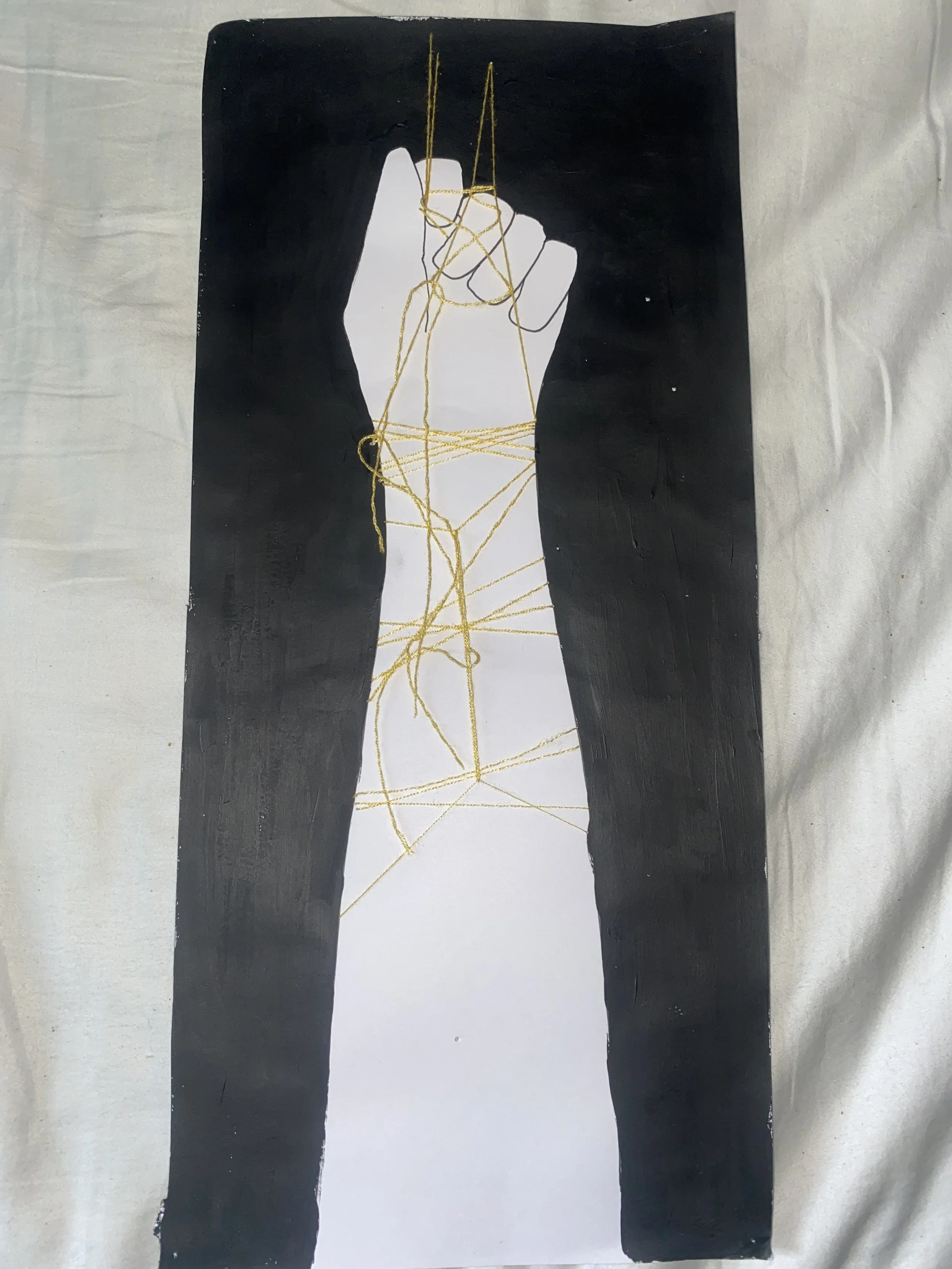
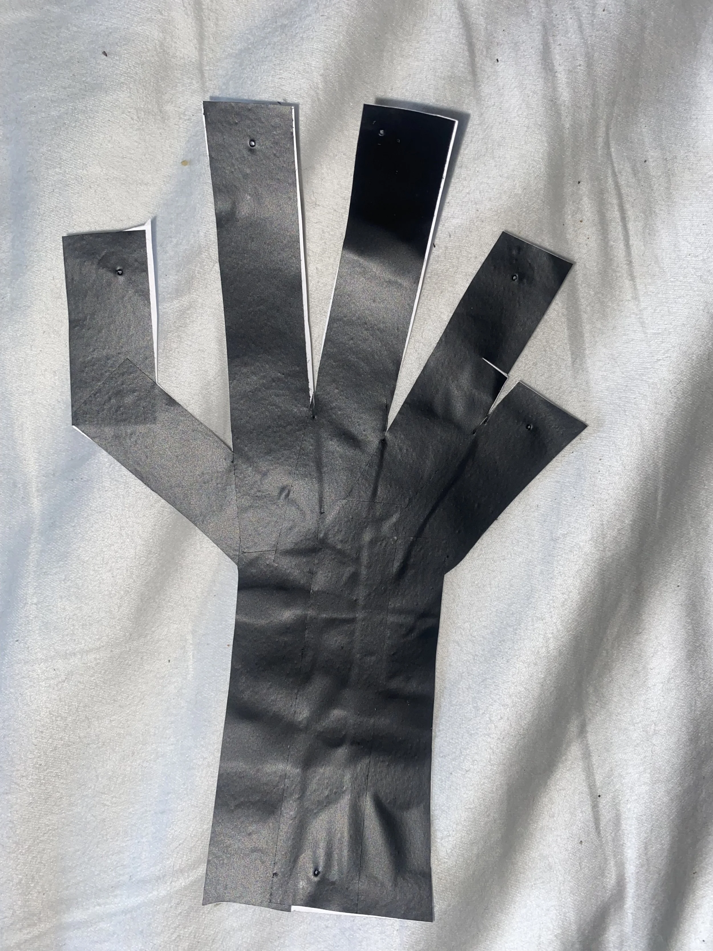
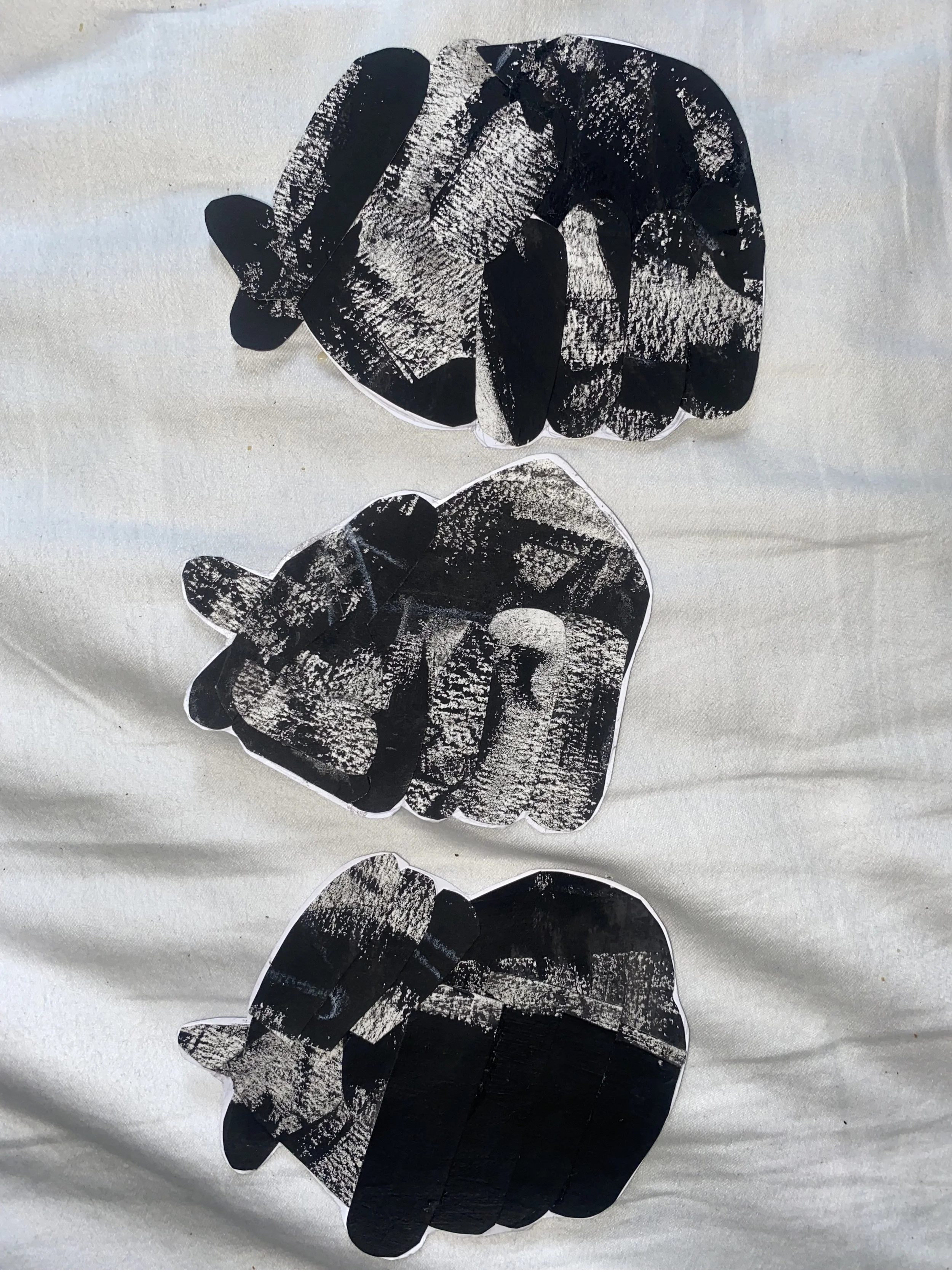
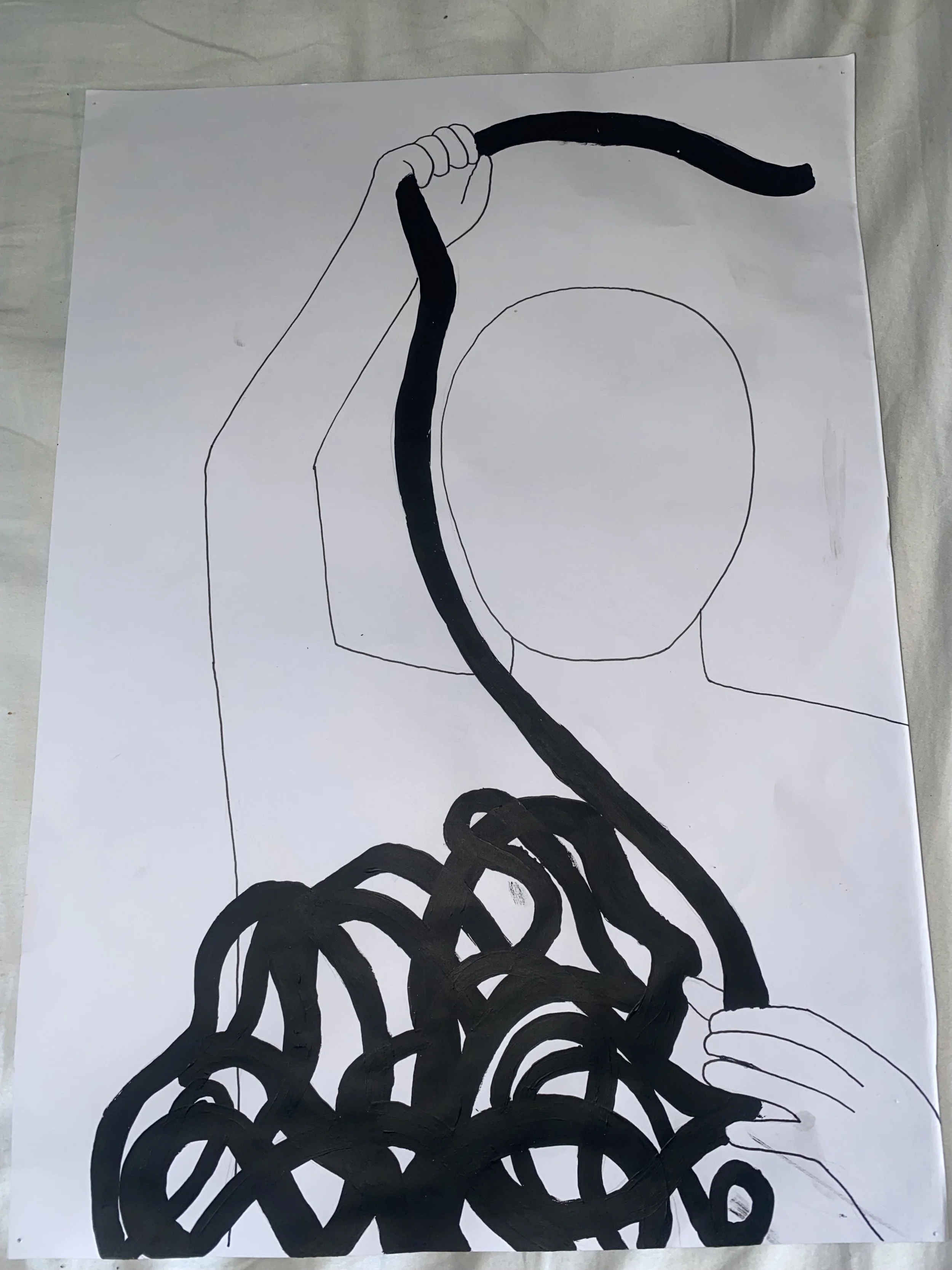
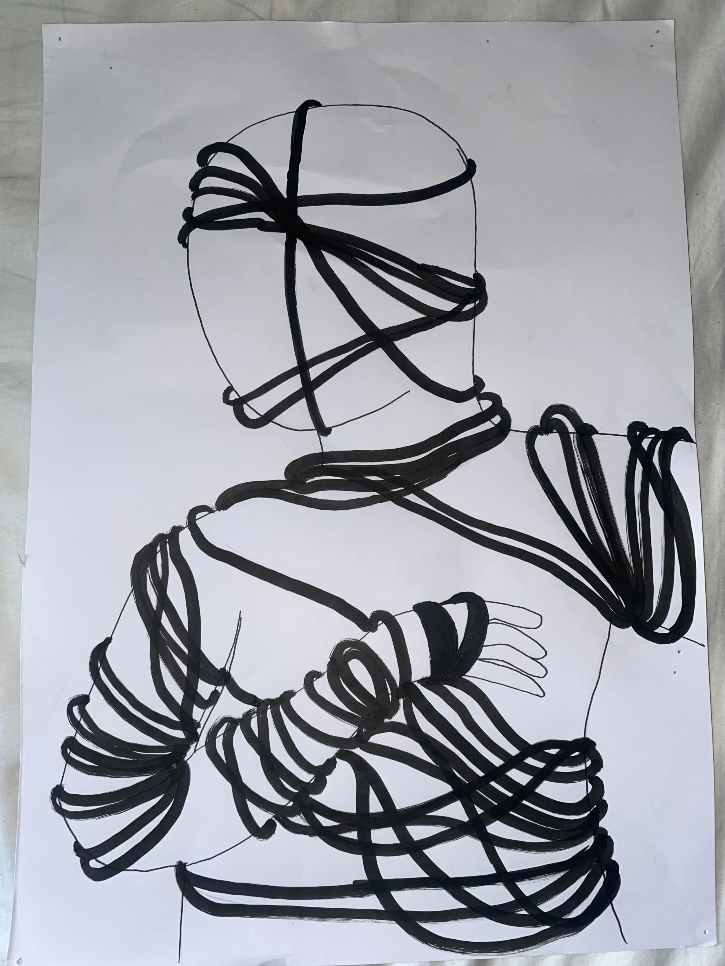
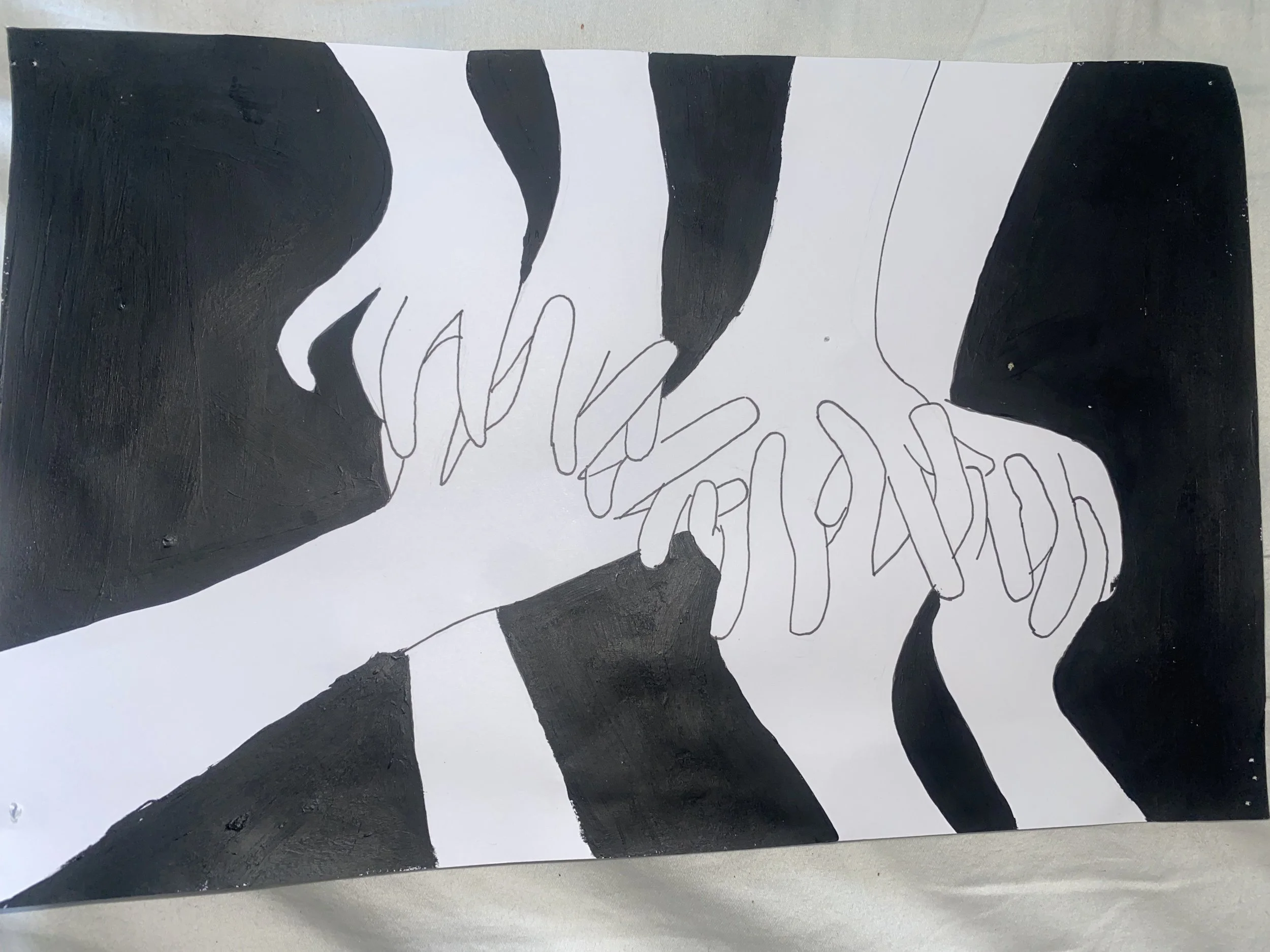
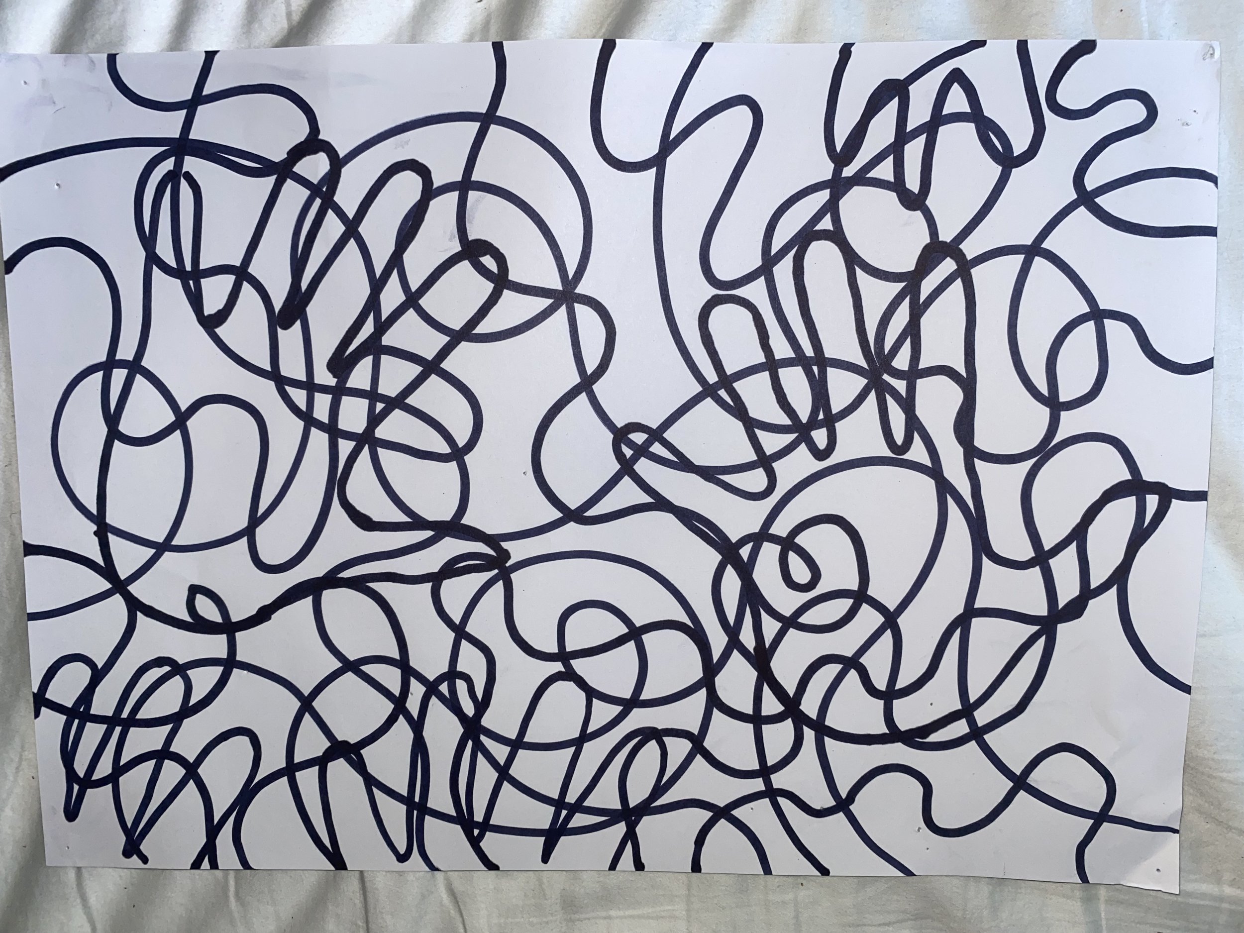
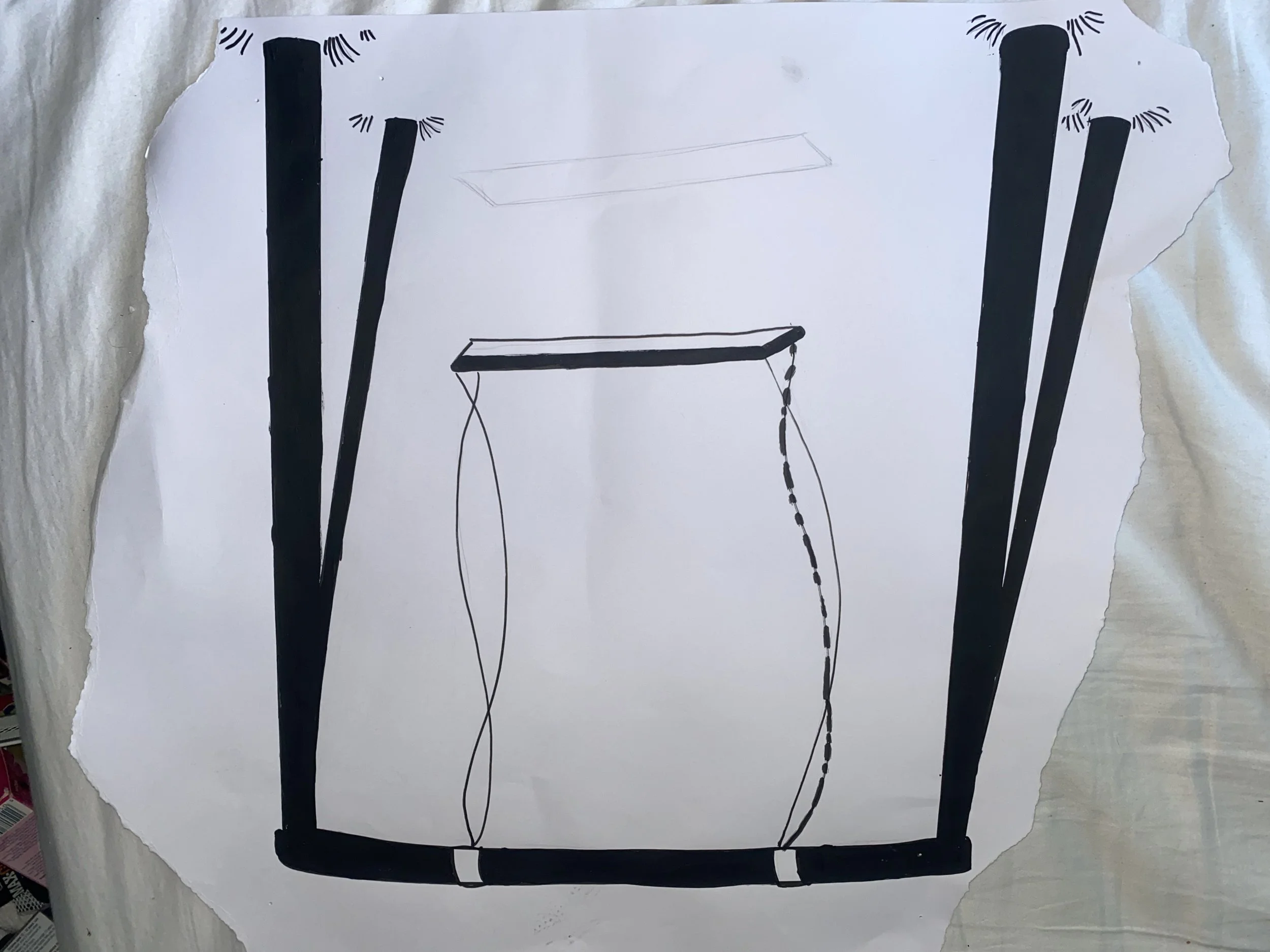
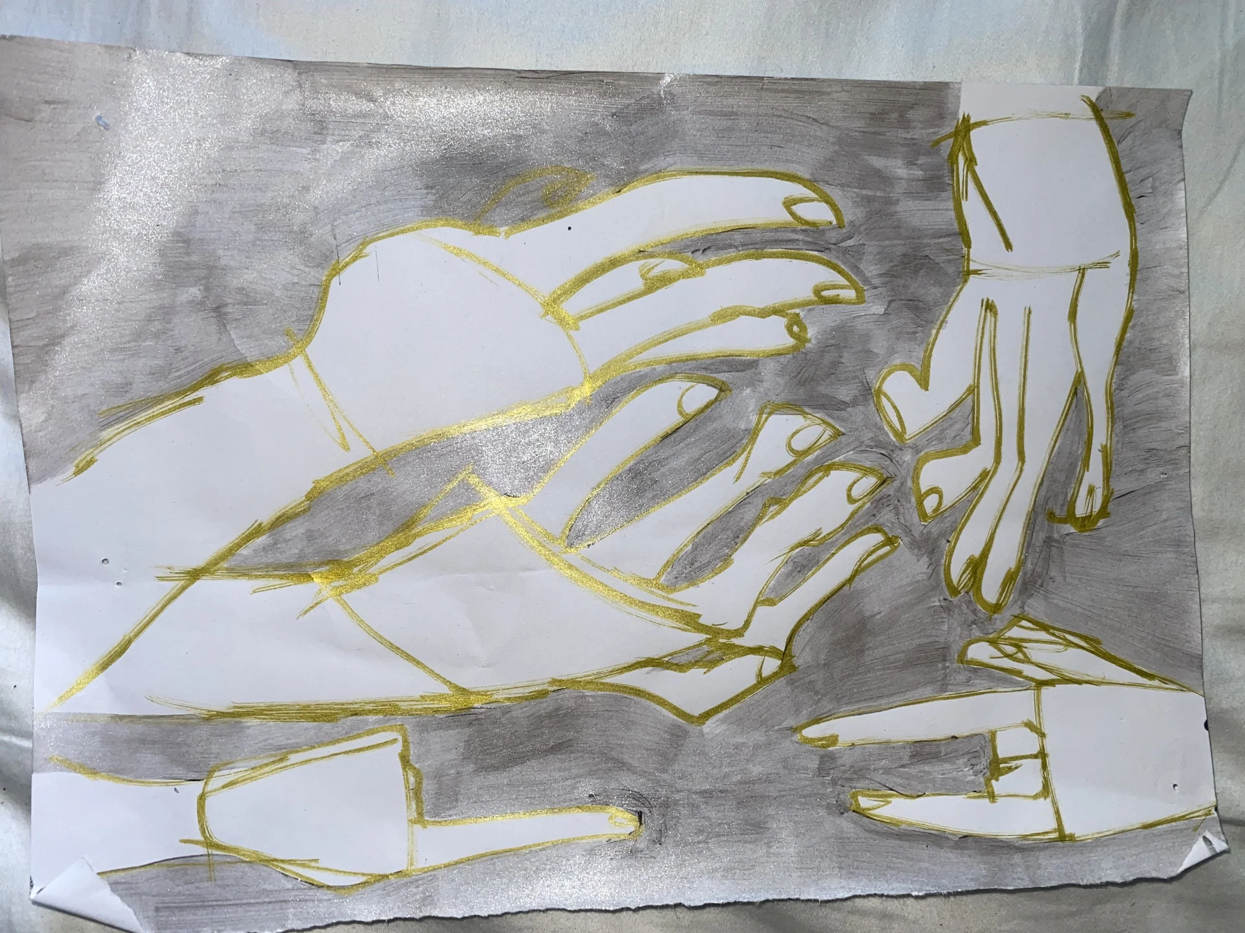
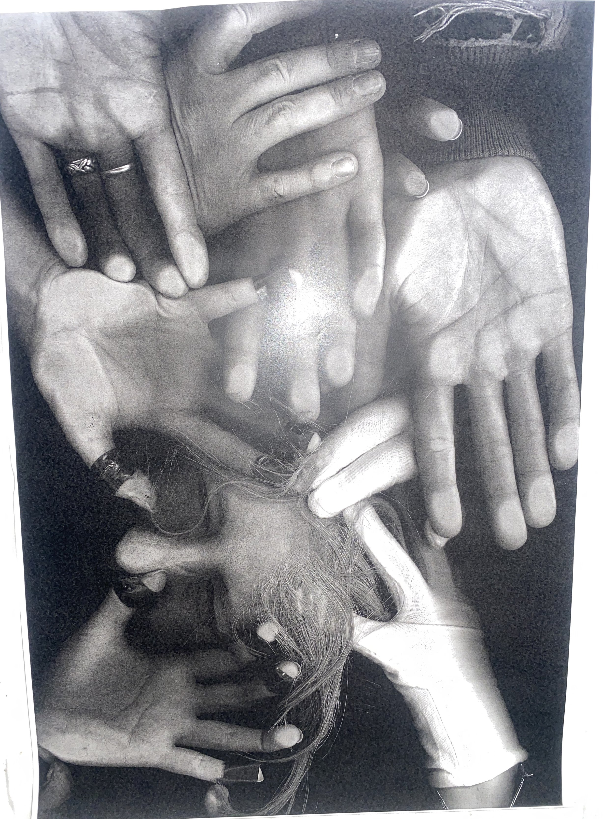
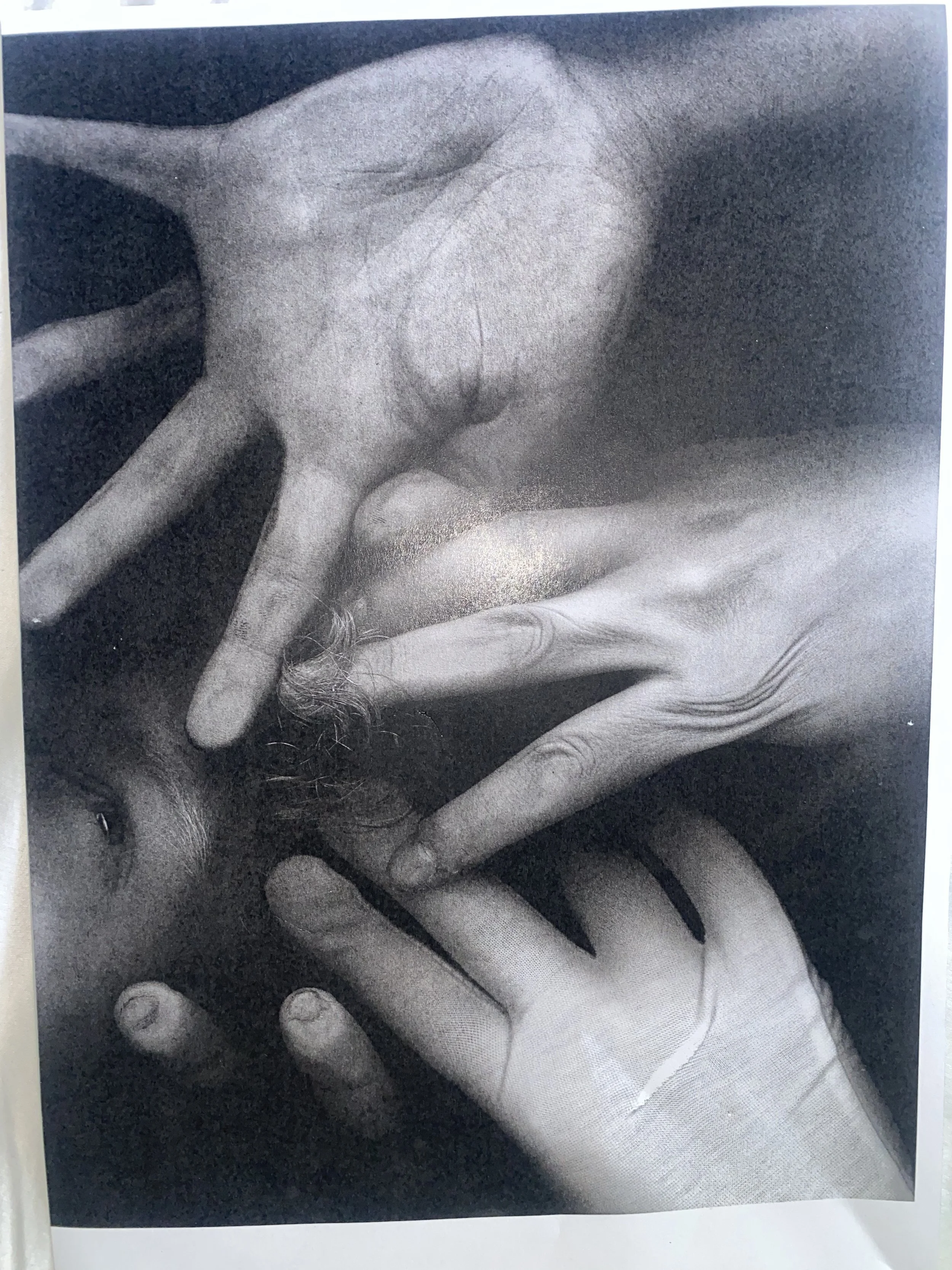
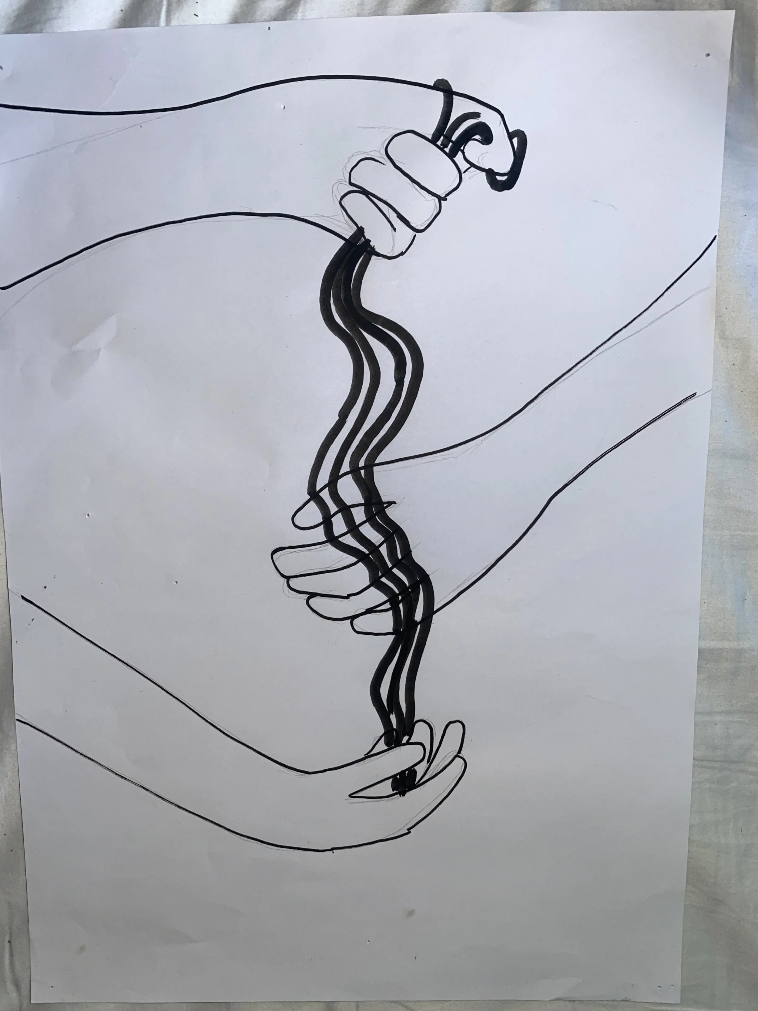
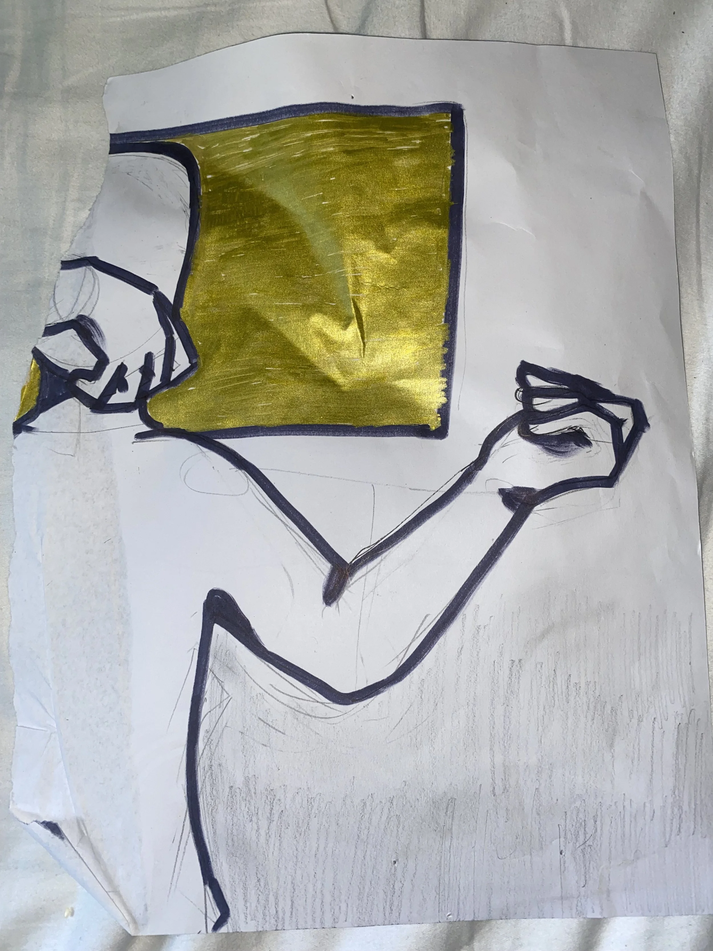
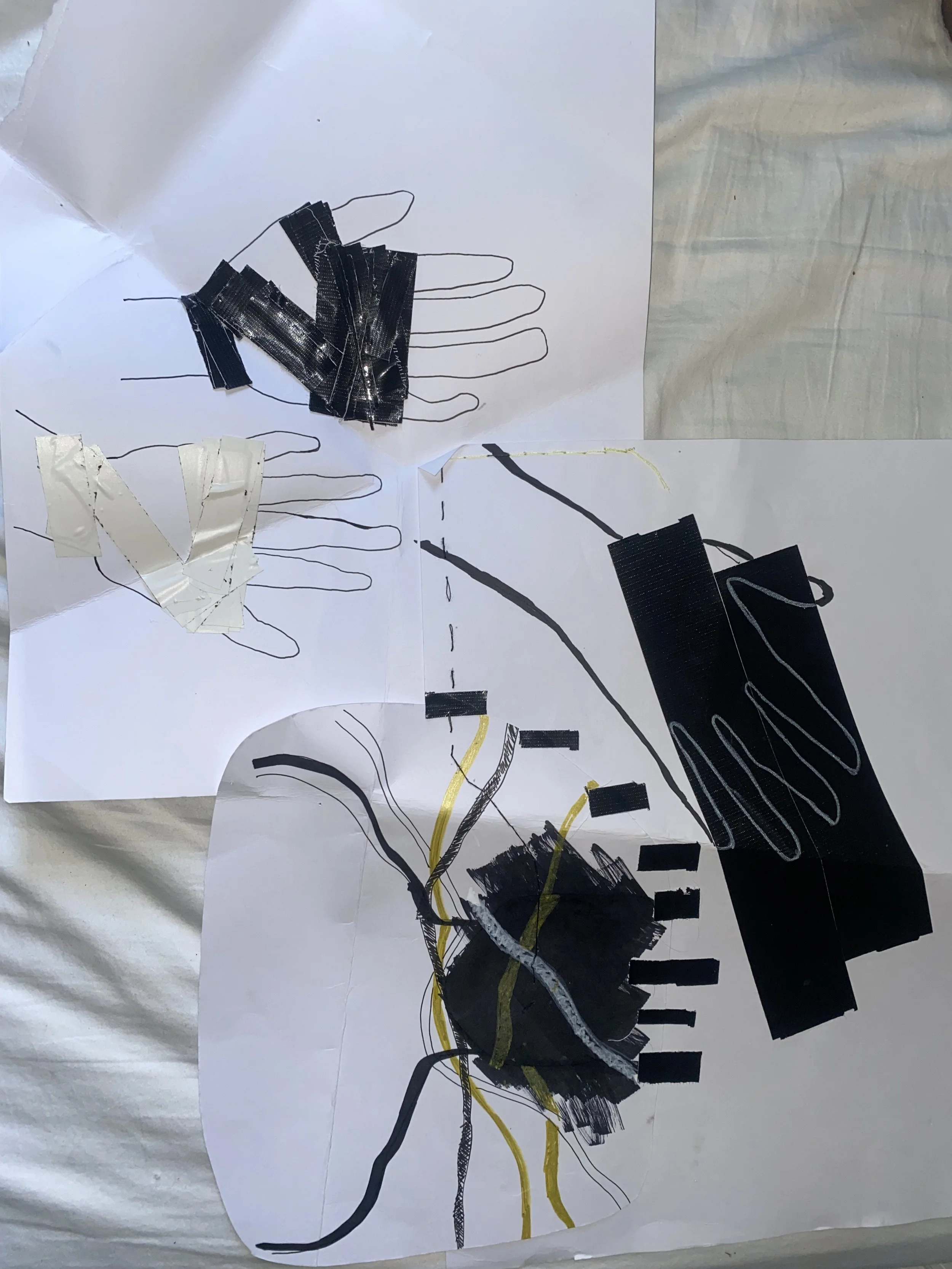
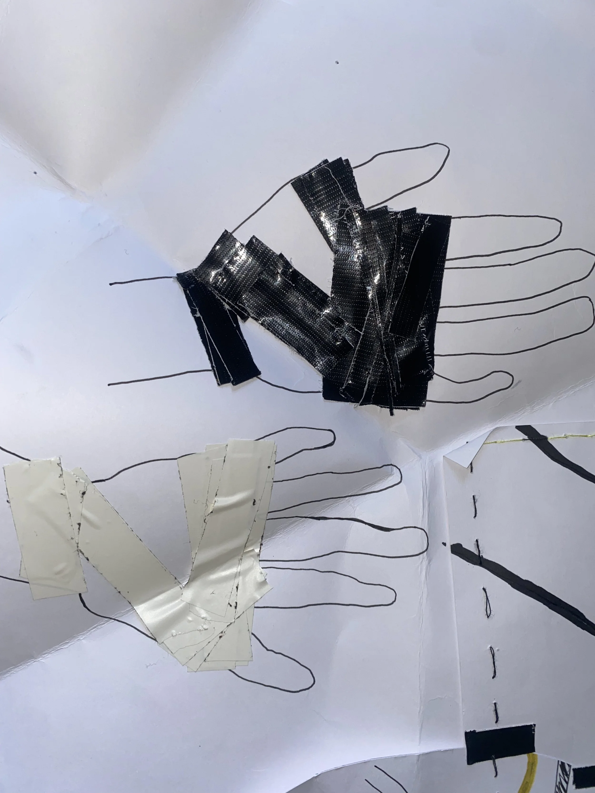
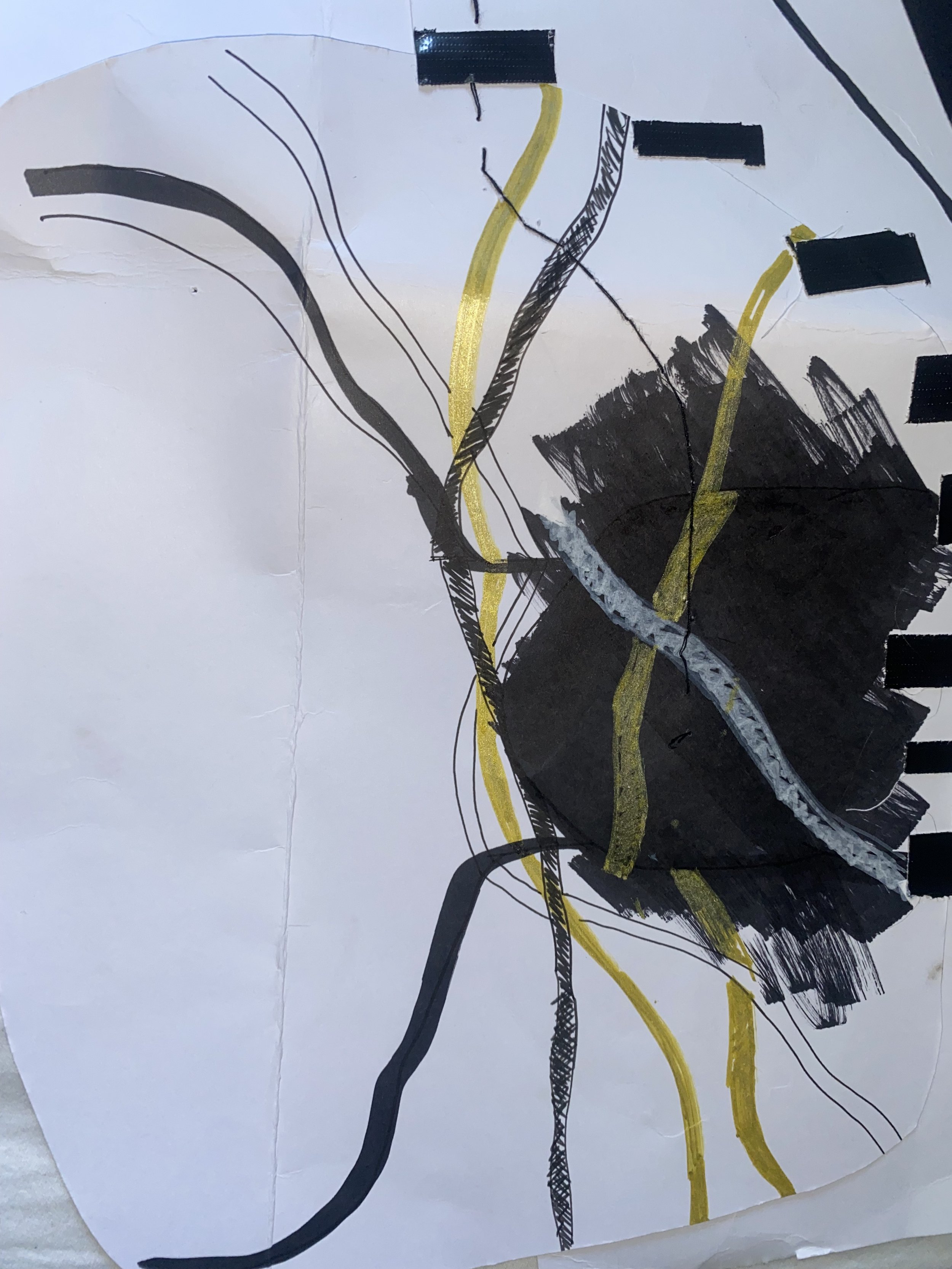
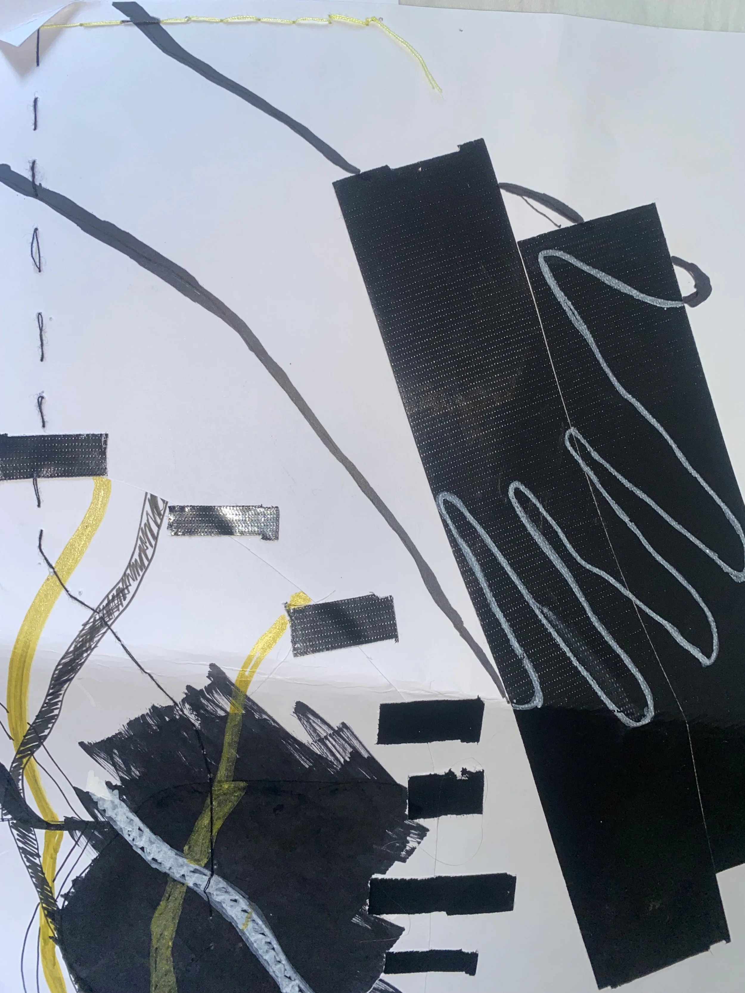
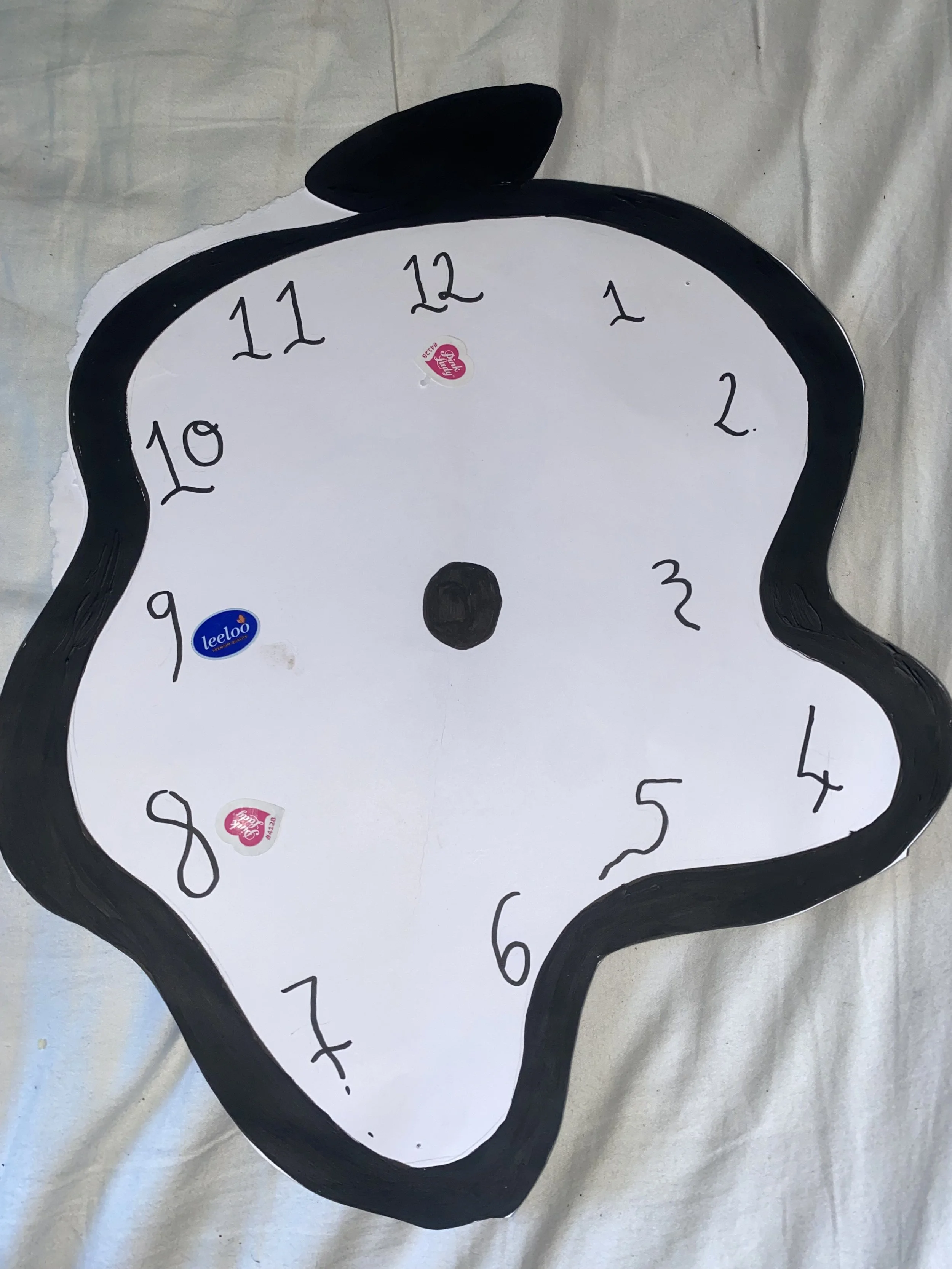
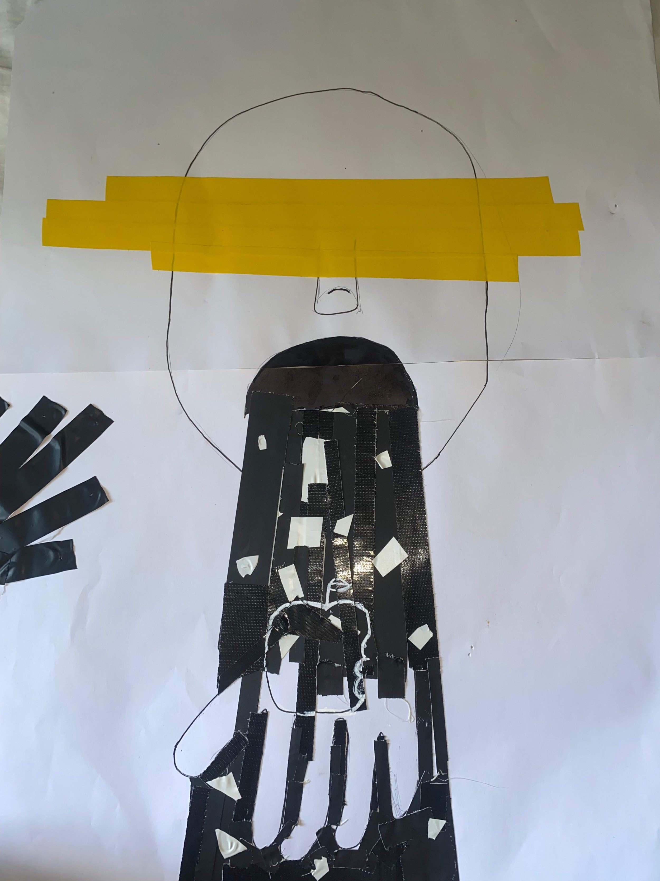
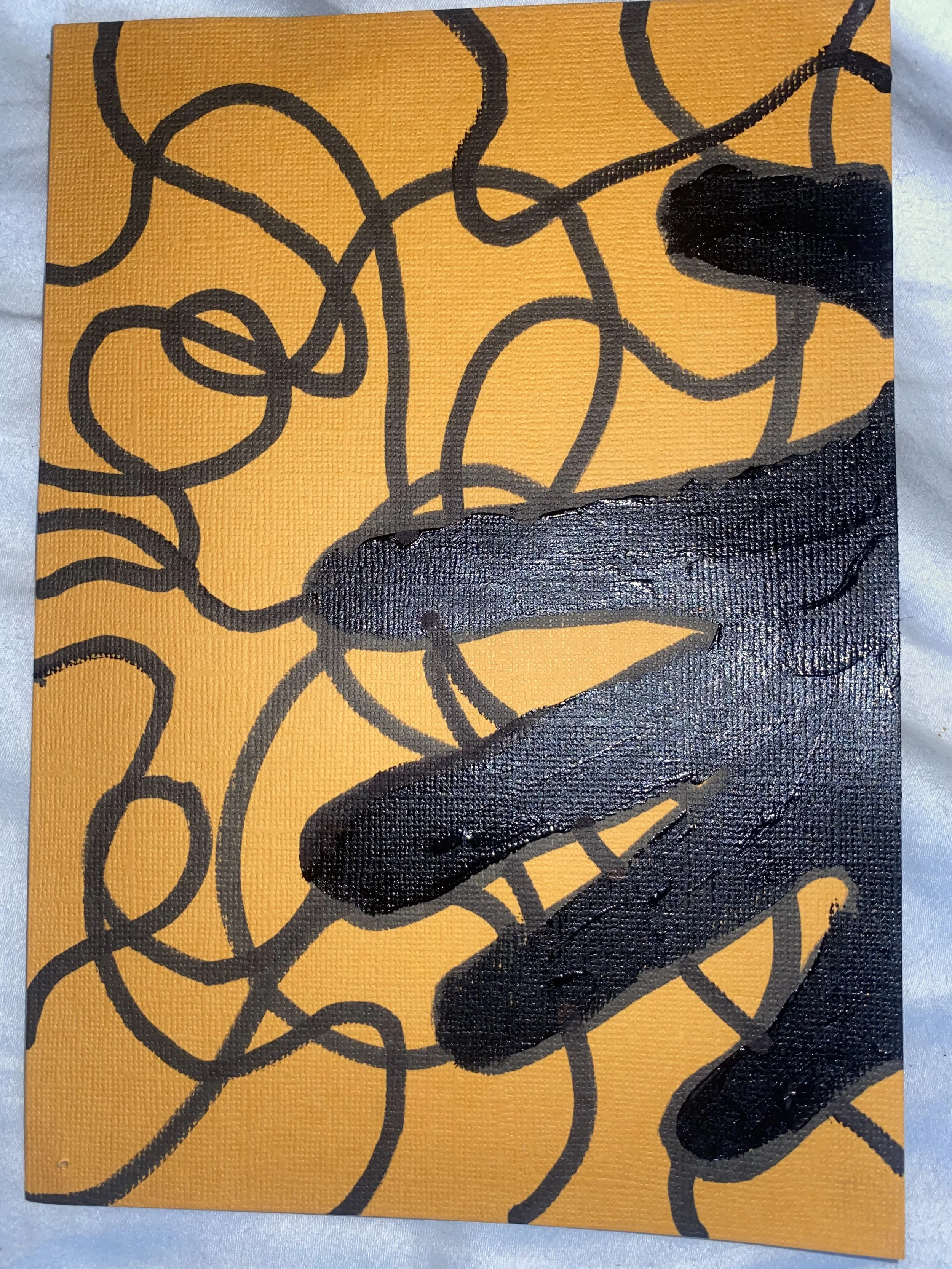
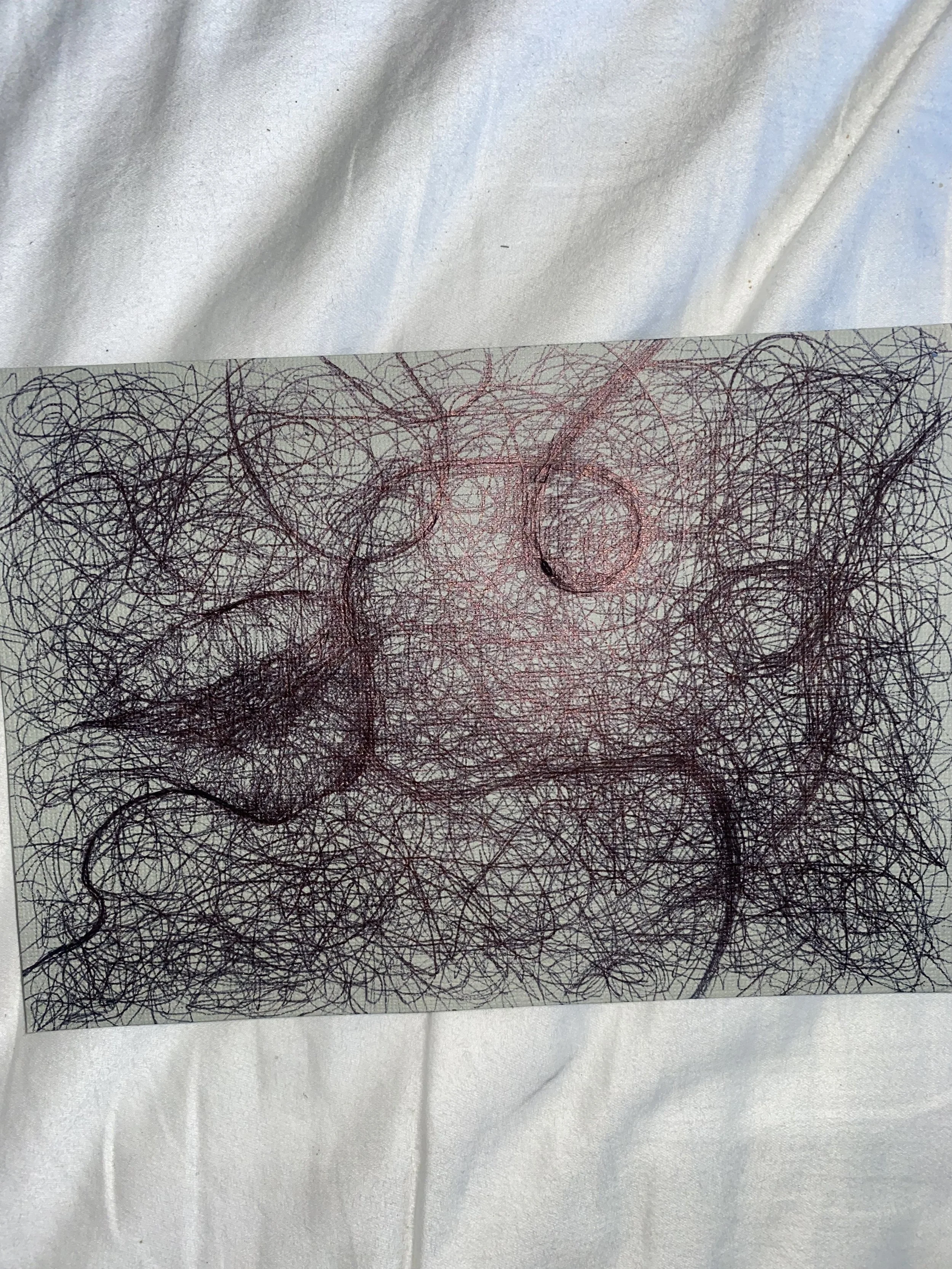
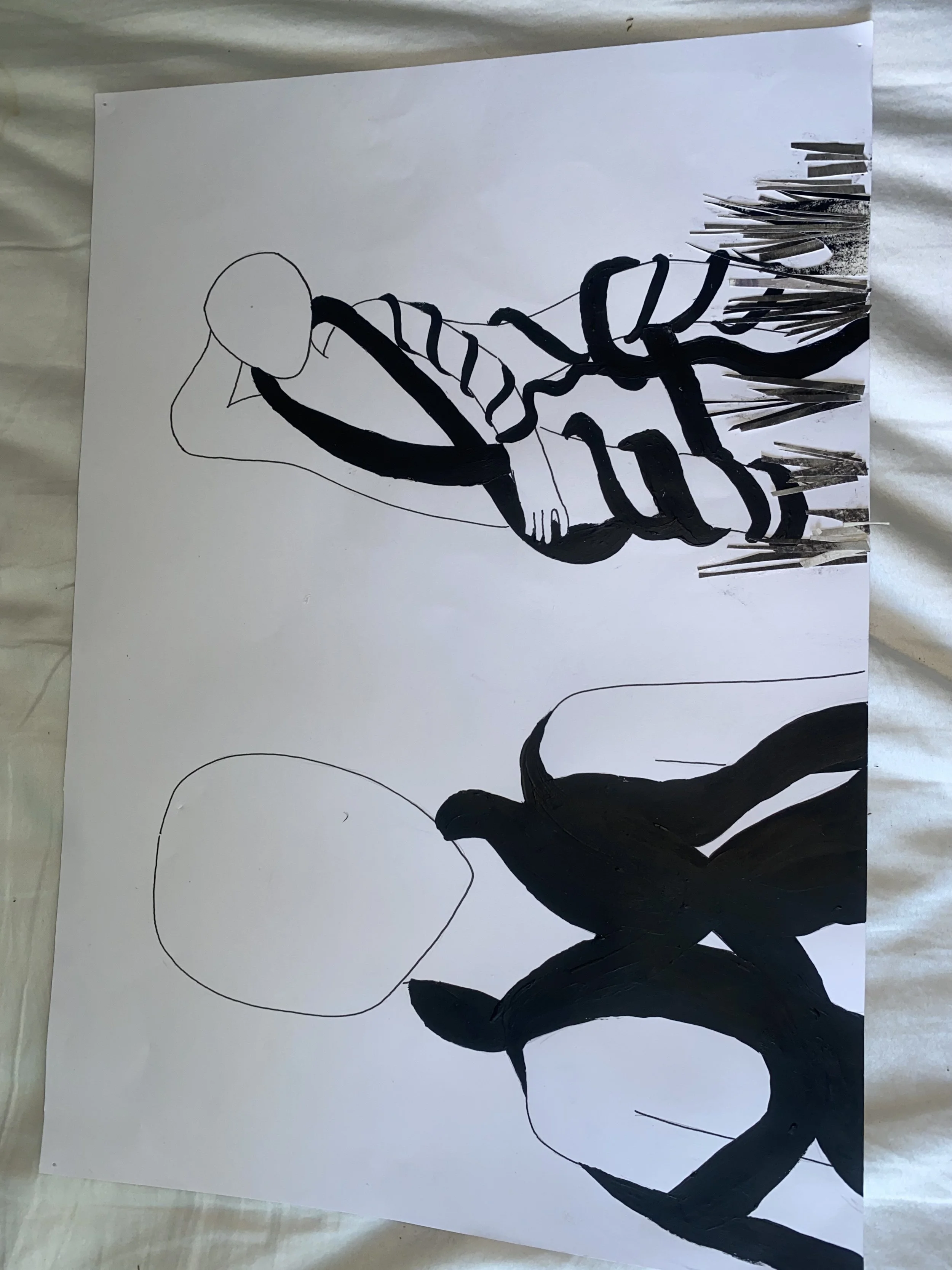
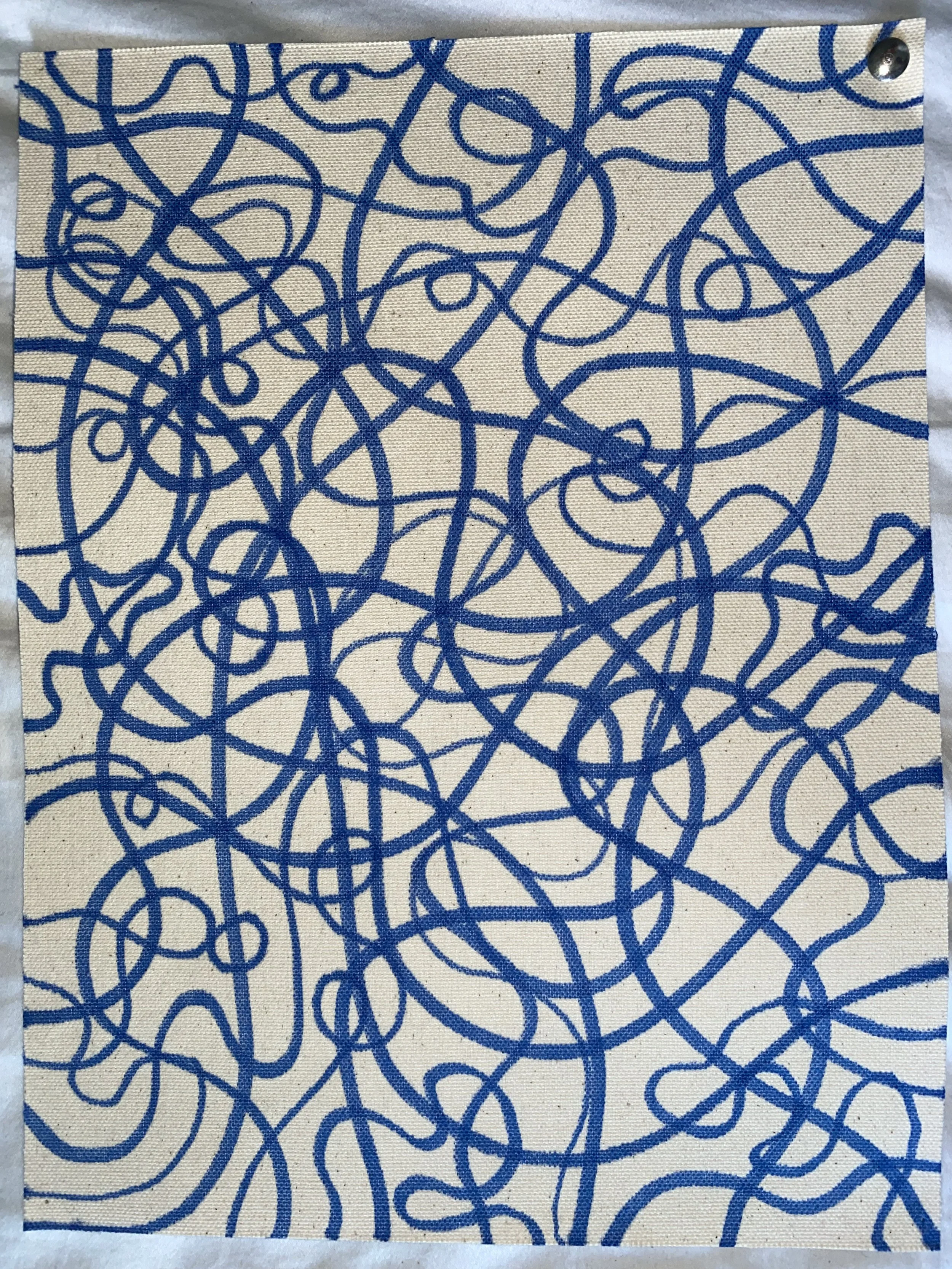
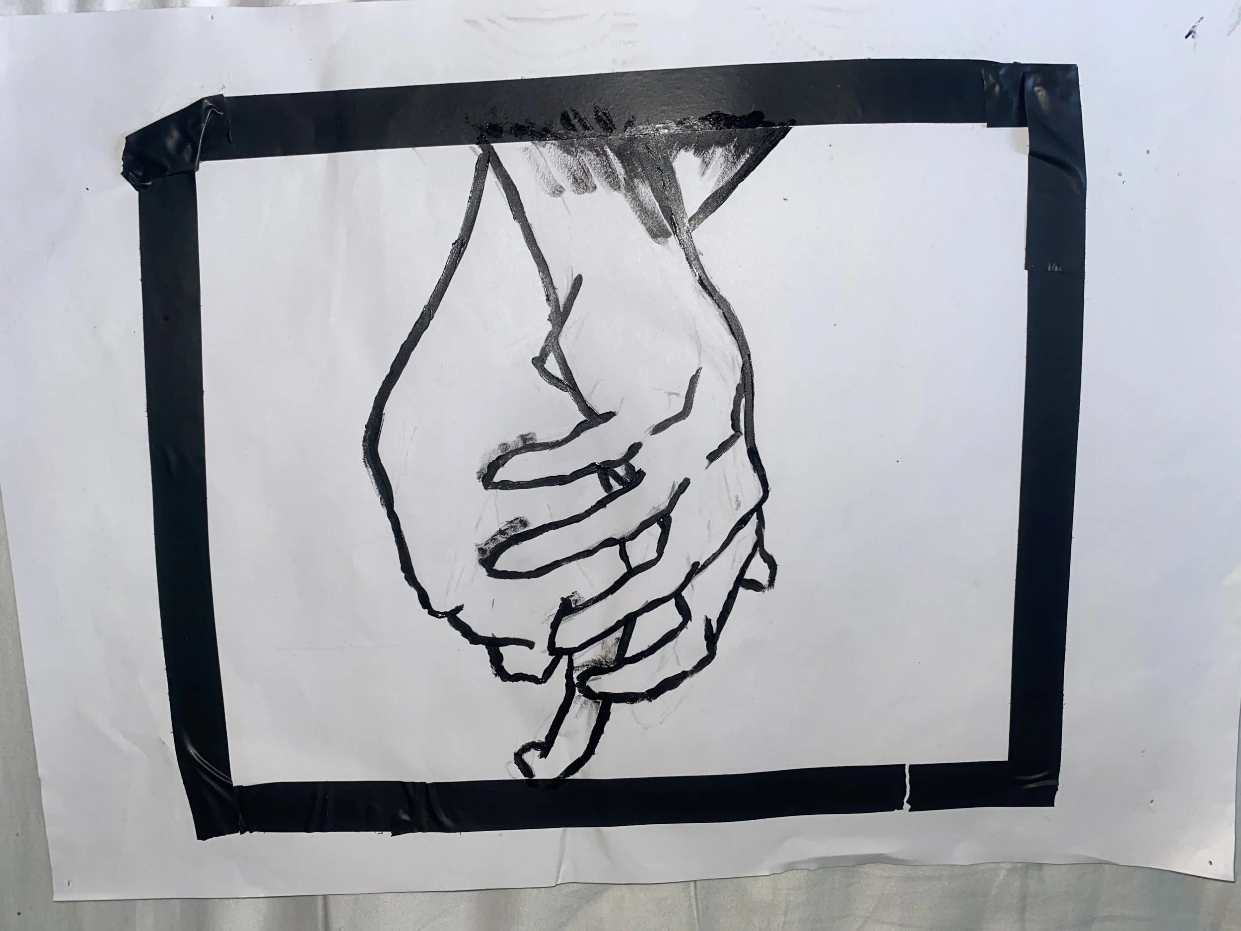
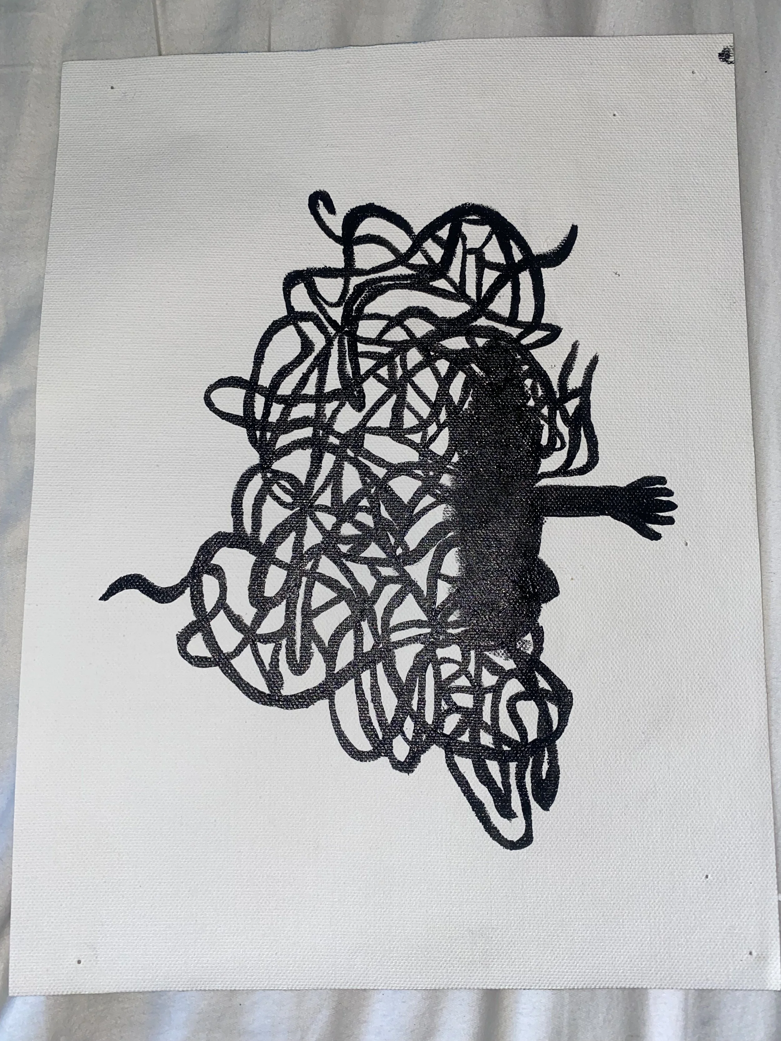
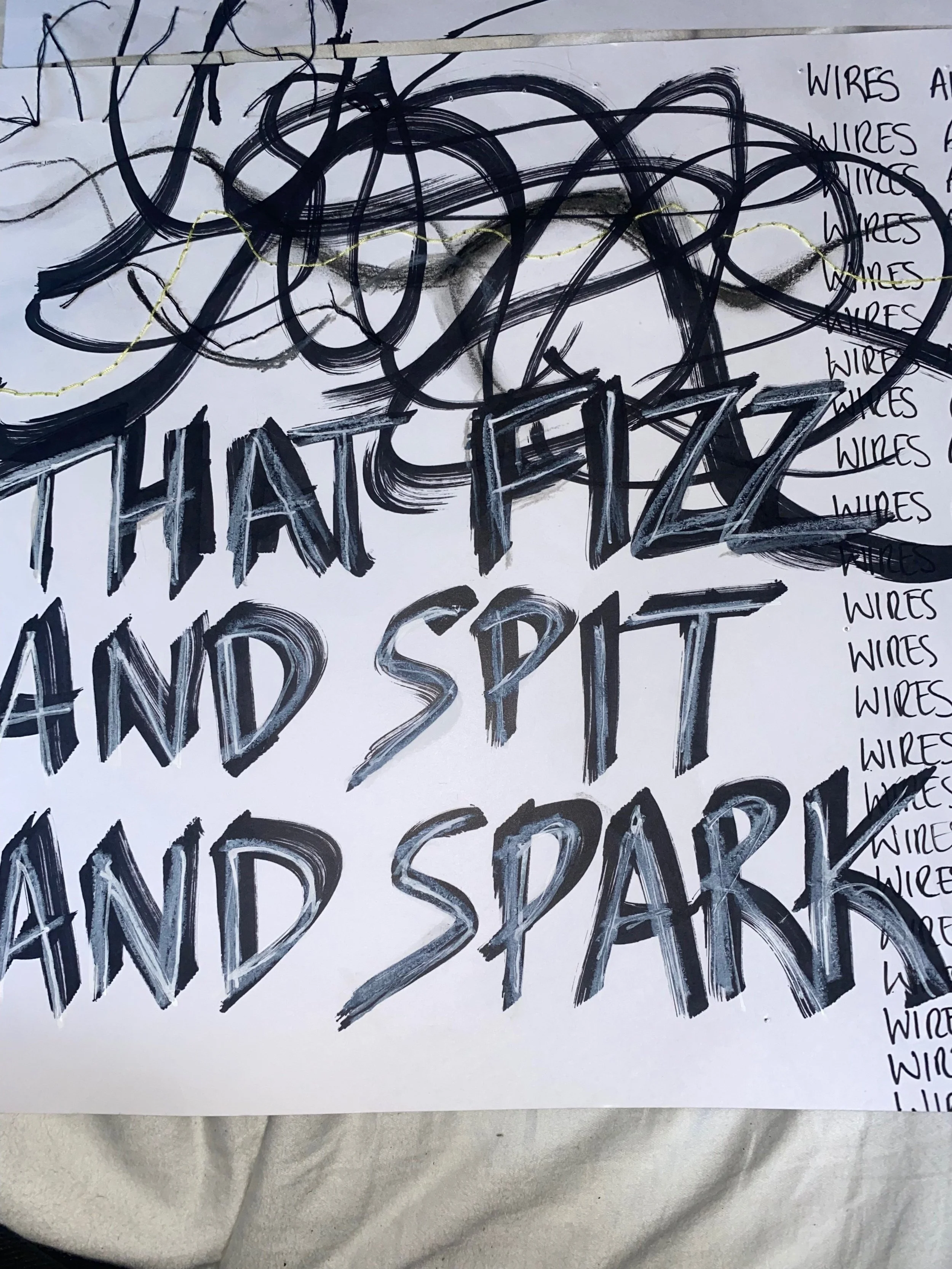
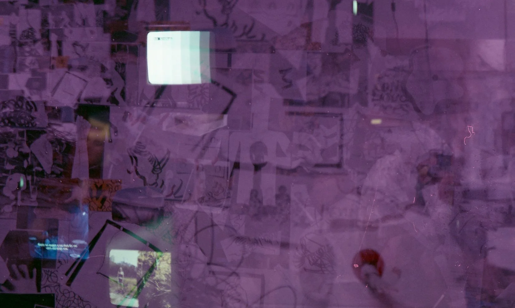
These were made primarily by myself and Becca with contributions from other members of the team and can be viewed below. I also included some photography that I had taken. I tended to use combination of materials to create texture - using marker pens on card along with oil pastels to draw wires before using thread to stitch a wire, taking care to make it uneven to make it disappear under some drawn wires so it seemed like it was actually tangled with the drawn wires. I also liked using different tapes, stacking some to make certain parts more 3D than others (like in the picture where the tape is on the drawn hand). Whilst it might not be fully visible from the back, when audience members come to look at the back wall (which tended to happen at the end of the show) they could tell a lot better. Even at a distance, the combination of materials and also types of picture (drawn images, adapted posters, canvas, photocopy, 35mm film scans) creates visual texture and also worked with the collage aspect of the piece. I finished these off with yellow twine (imitating the yellow wire) strung up, connecting different pieces to each other.


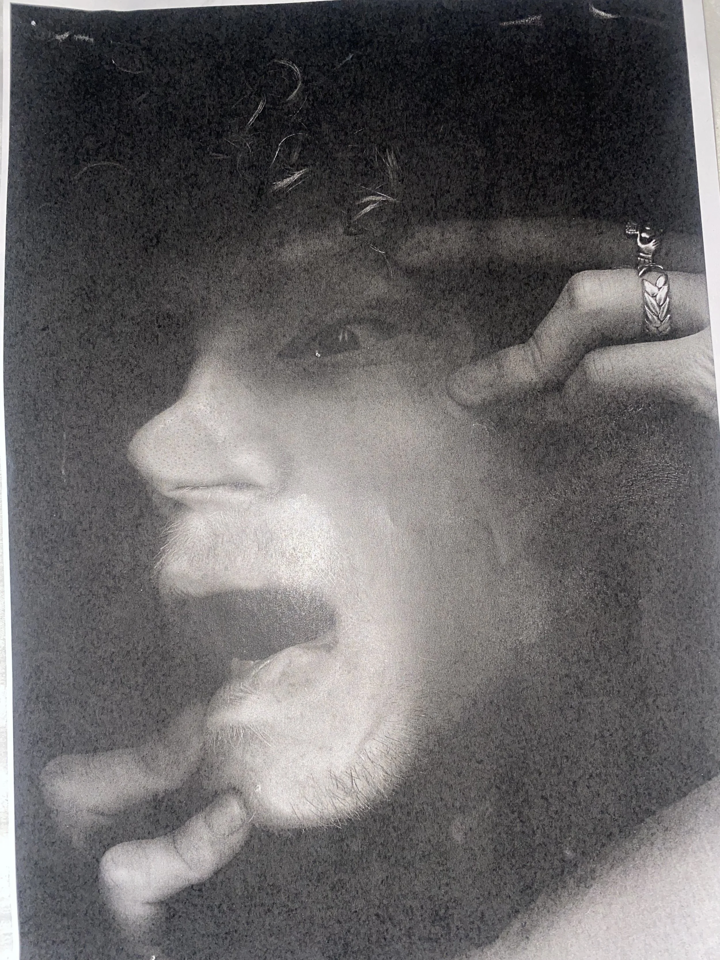


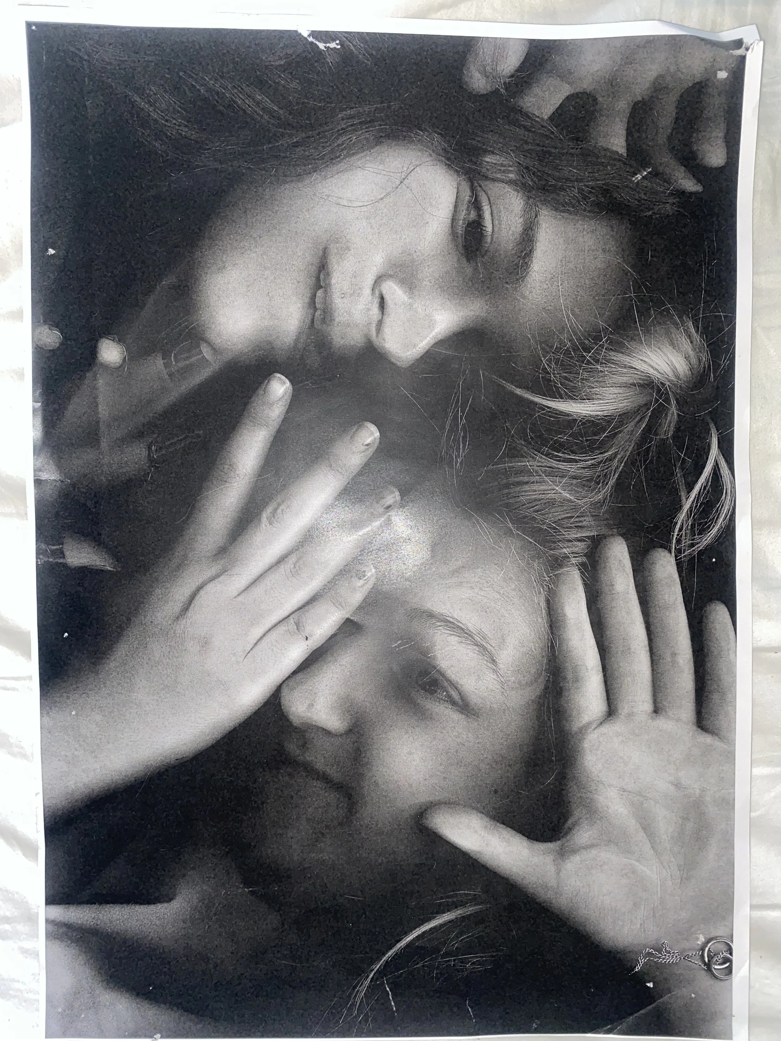
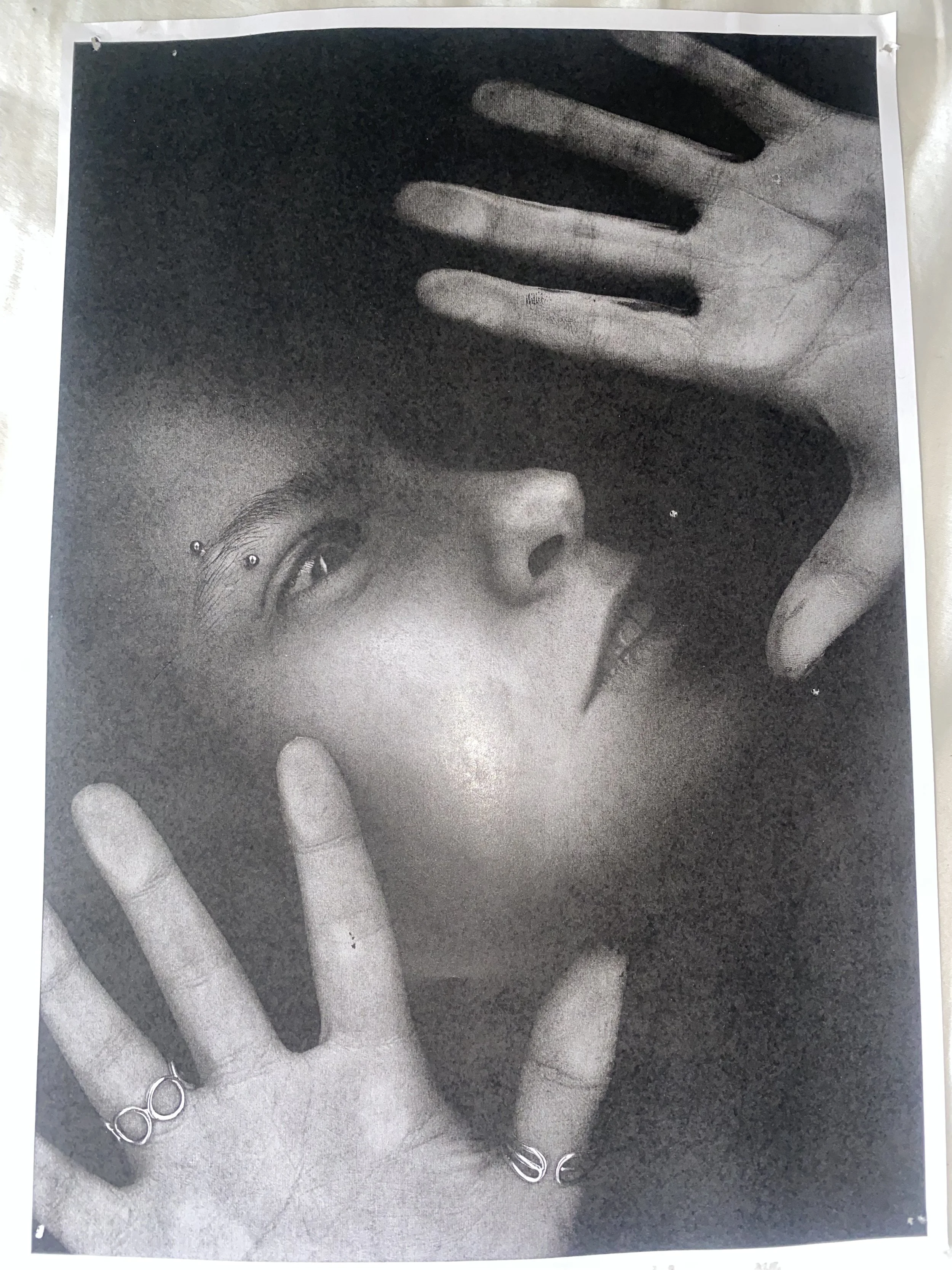


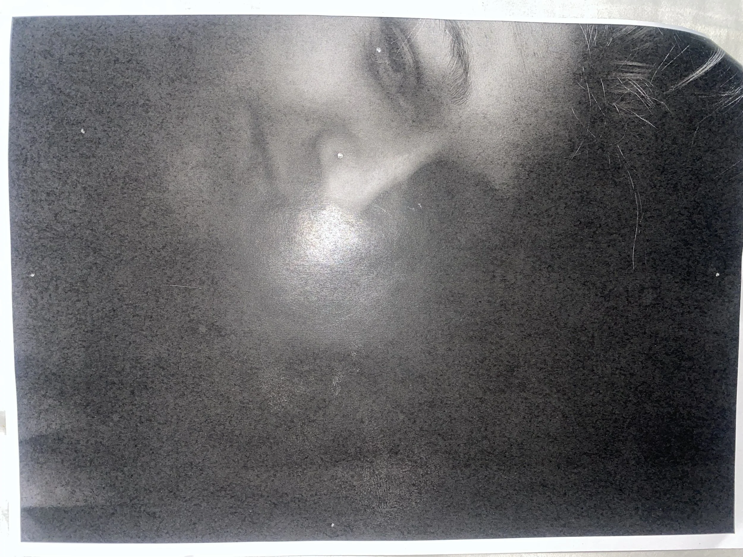
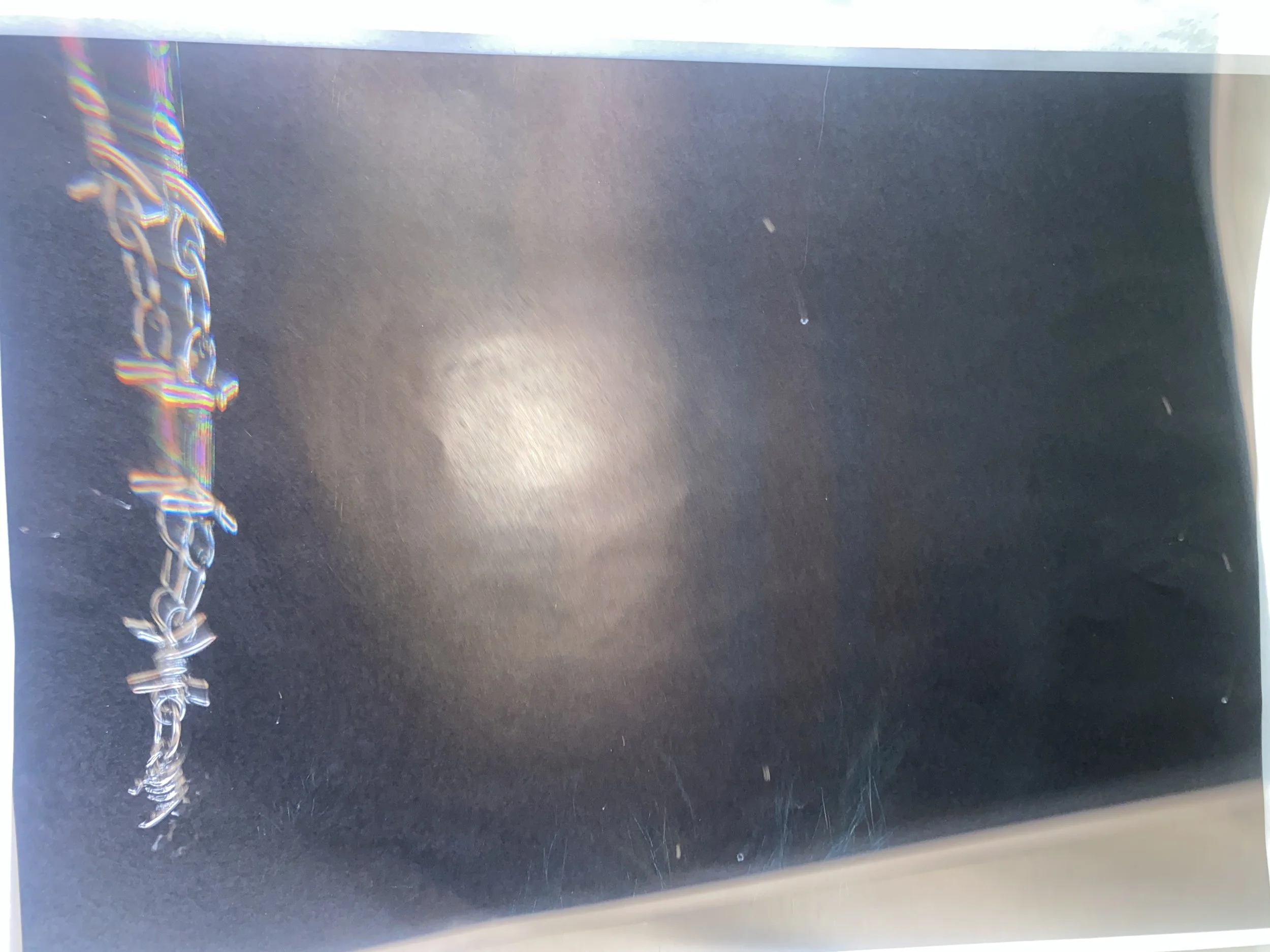
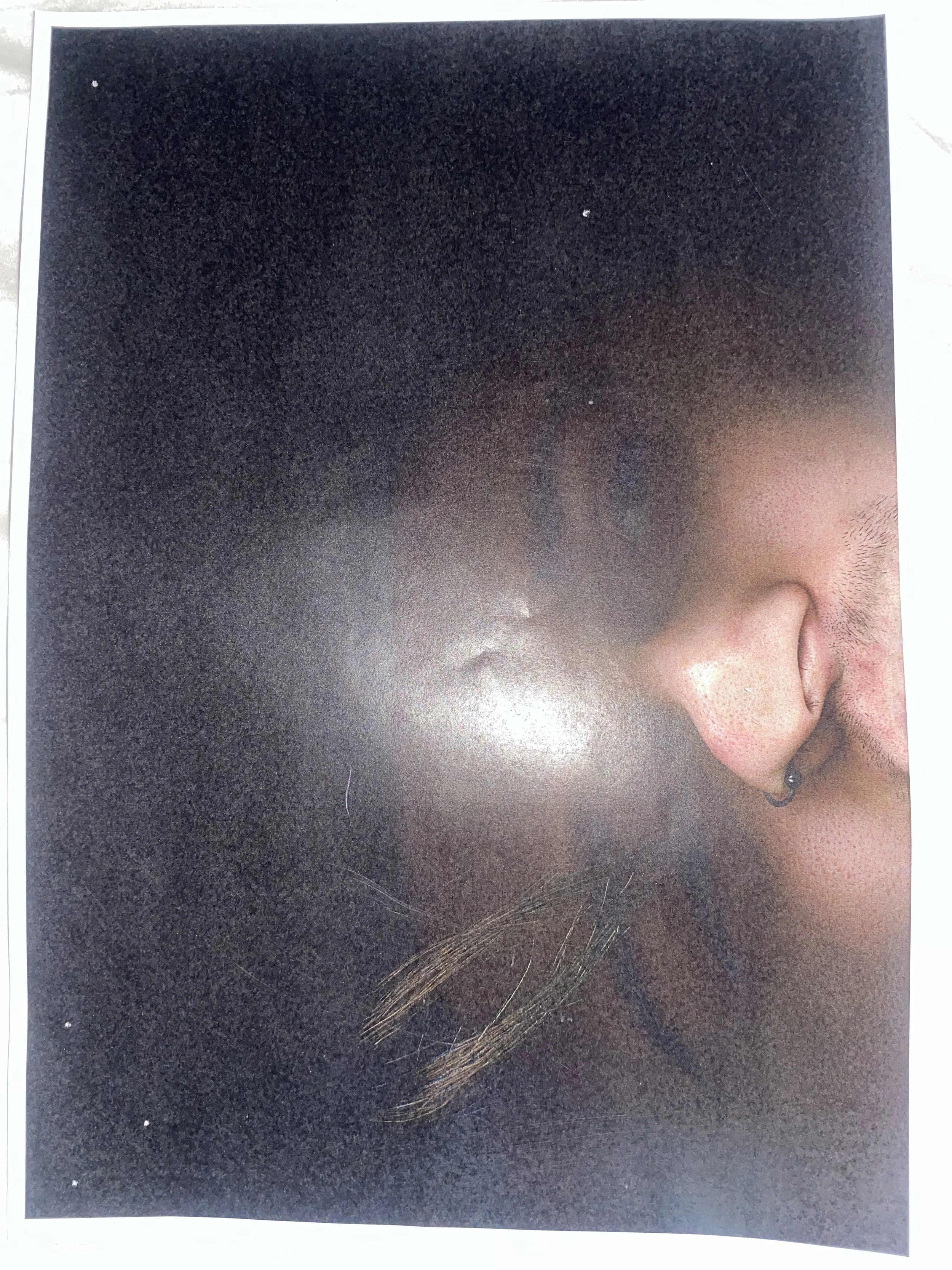
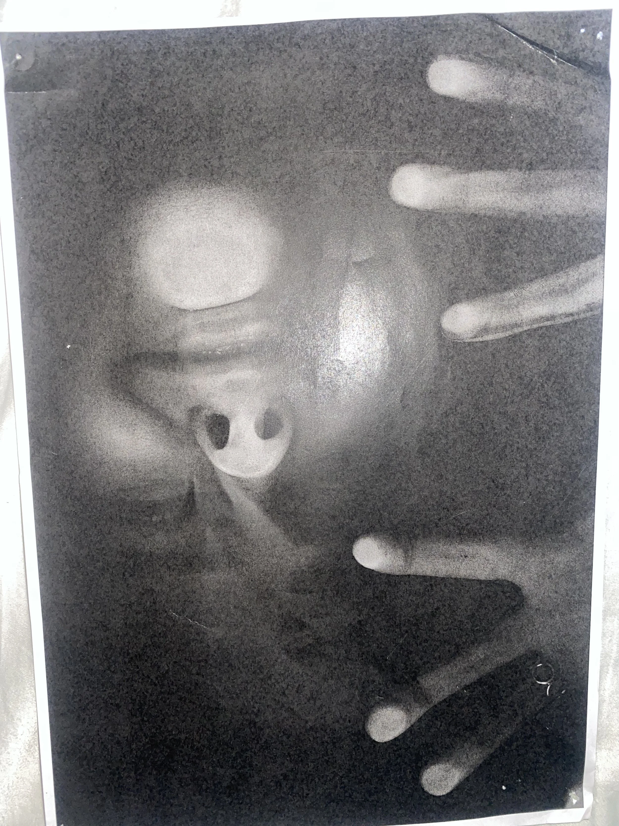

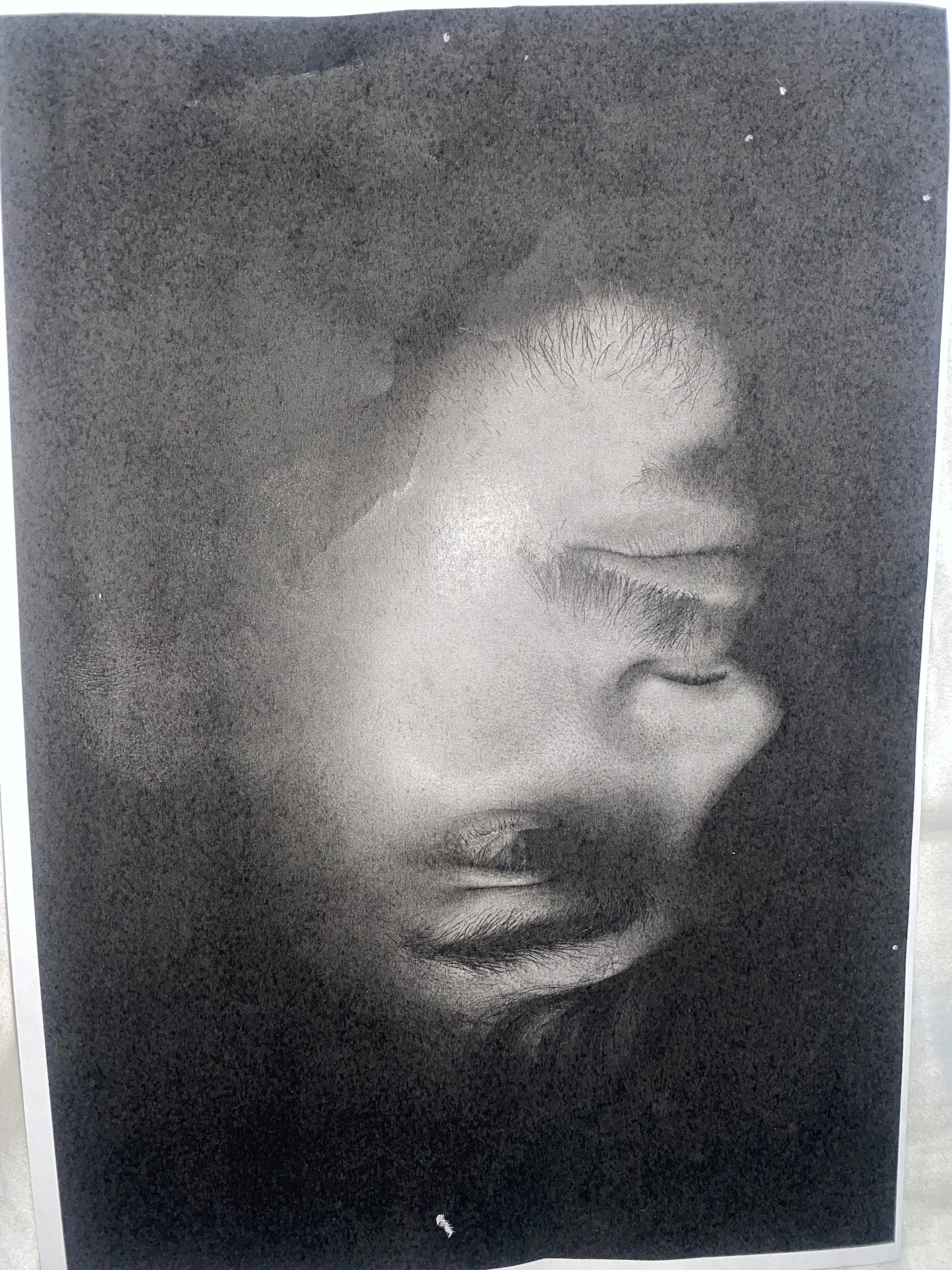
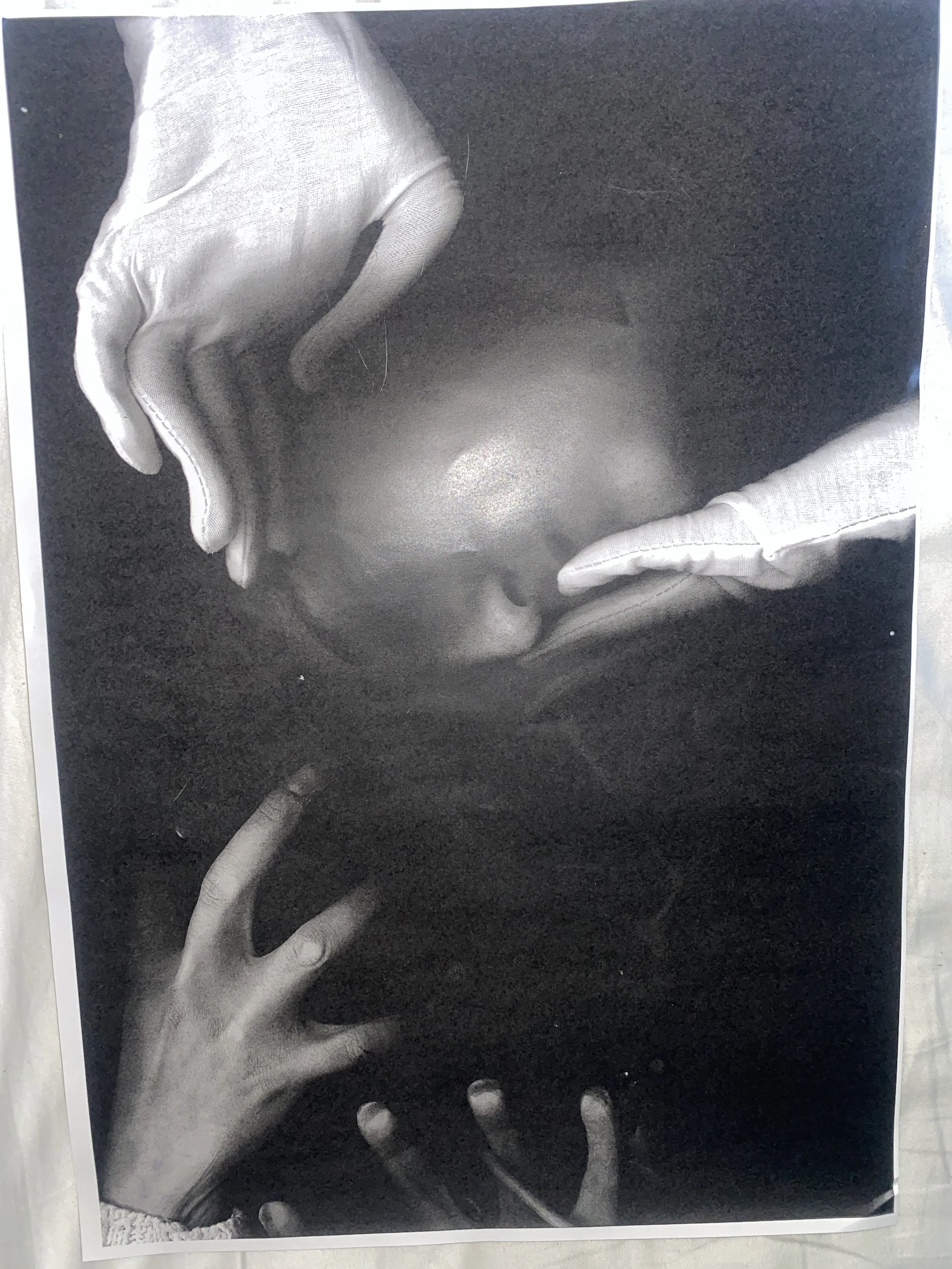
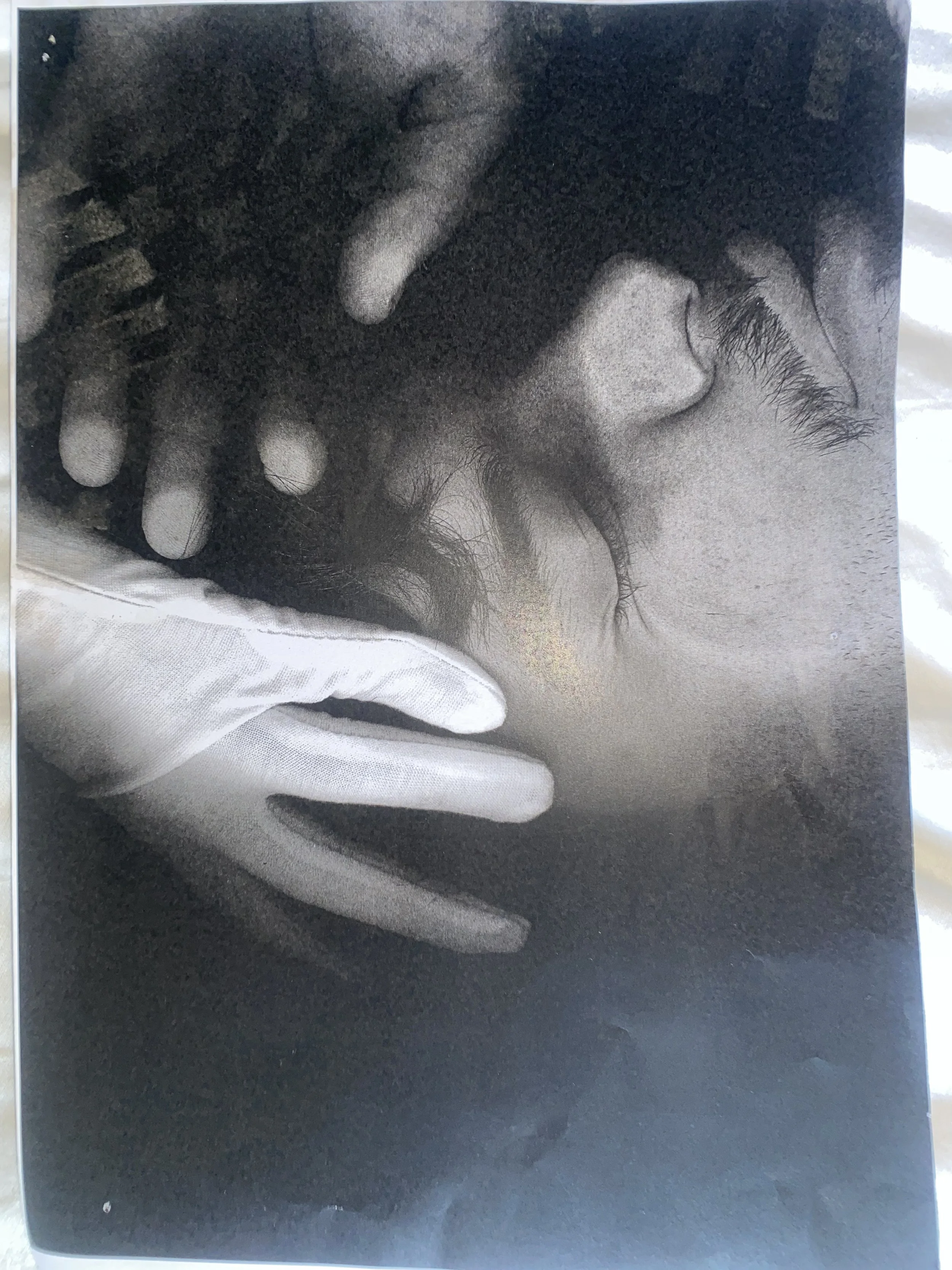


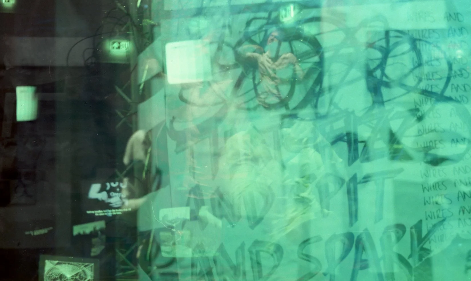
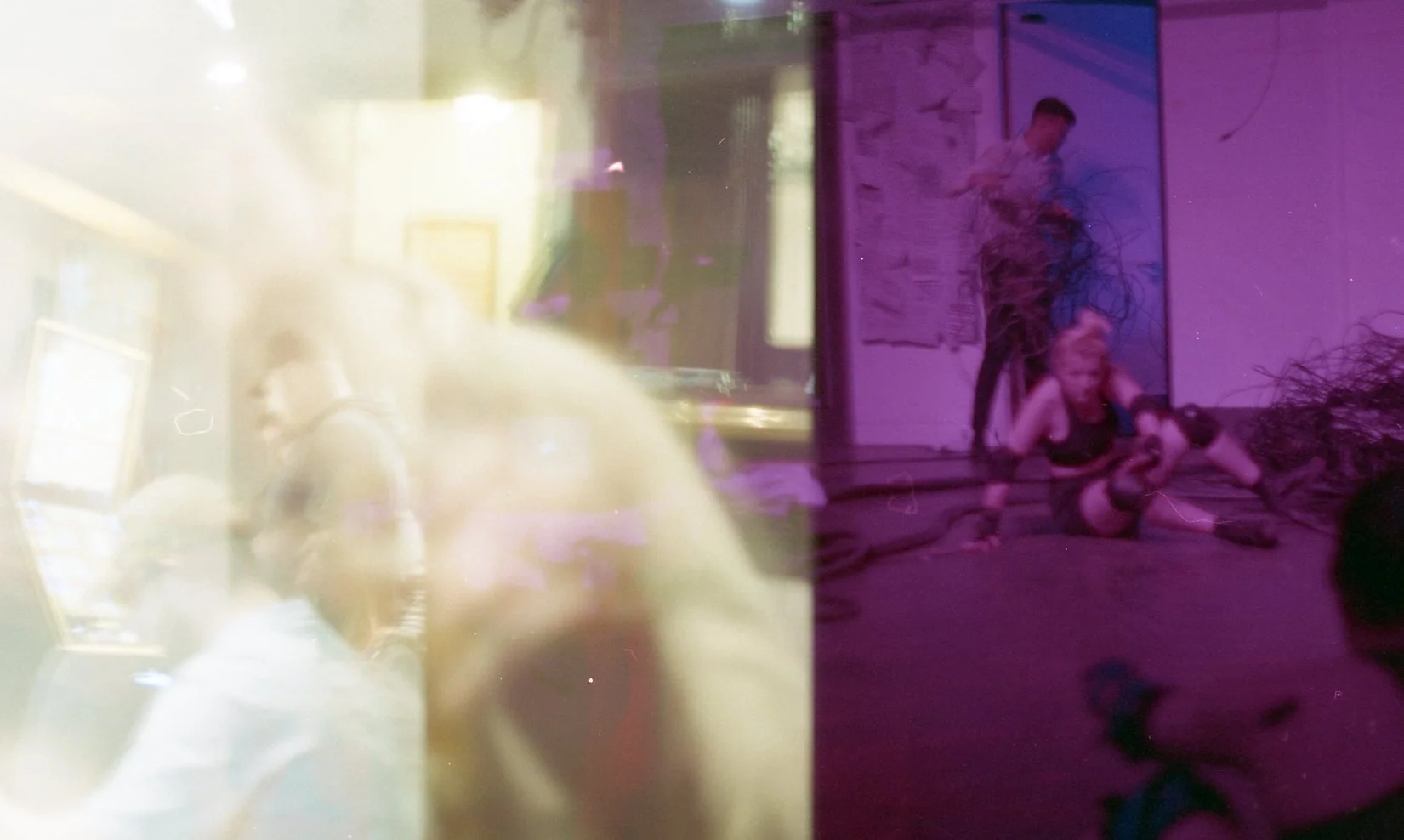
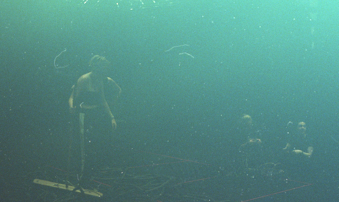
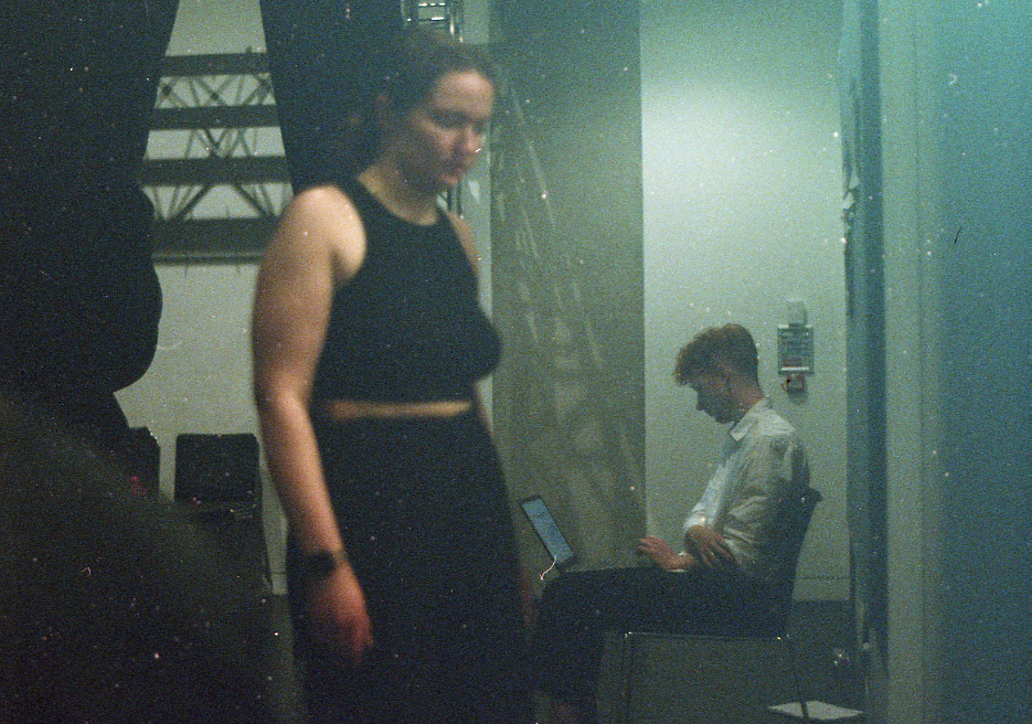
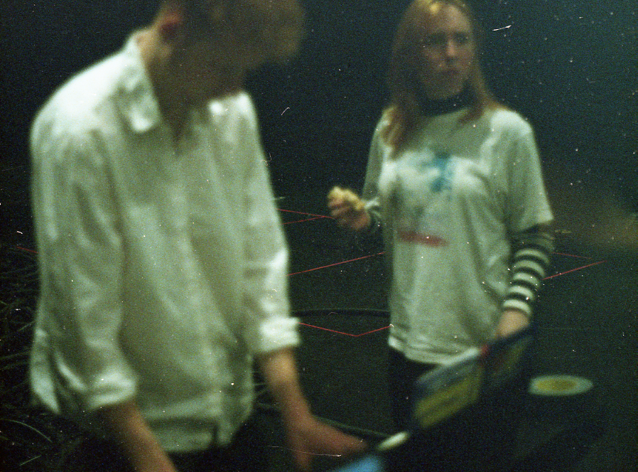
Over the course of this show I took some photos - the photography making it into the set. Earlier in the process I learned how to process my own film and signed up to the induction so was very eager to incorporate the new skills I learned into something. These are a collection of photos I took during the course of this play, some of which Alicia uses to pin to the wall during the show. I used my Praktica MTL 5 35mm camera to take these photos, developed the film myself in the C-41 Processing room and then learned how to scan the negatives using the Epson scan beds in Chatham’s scan bar.
During a feedback session, Kevin suggested dressing up the control room more and the idea of plants in the space was brought up which I took a shine to based on my original design inspiration. I also felt that with the abandonment of the idea of having plants in the space, this worked well to juxtapose the two spaces.
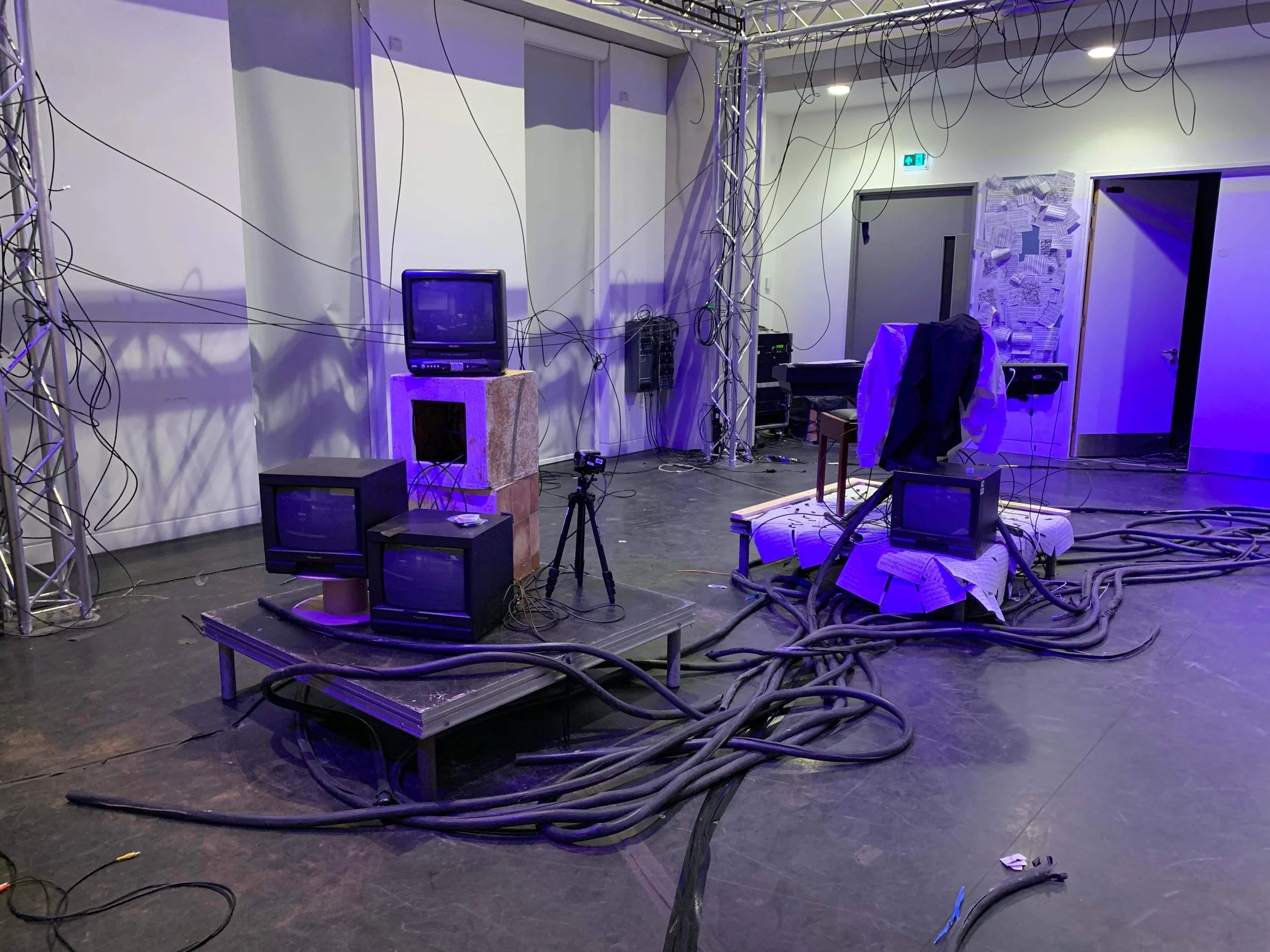
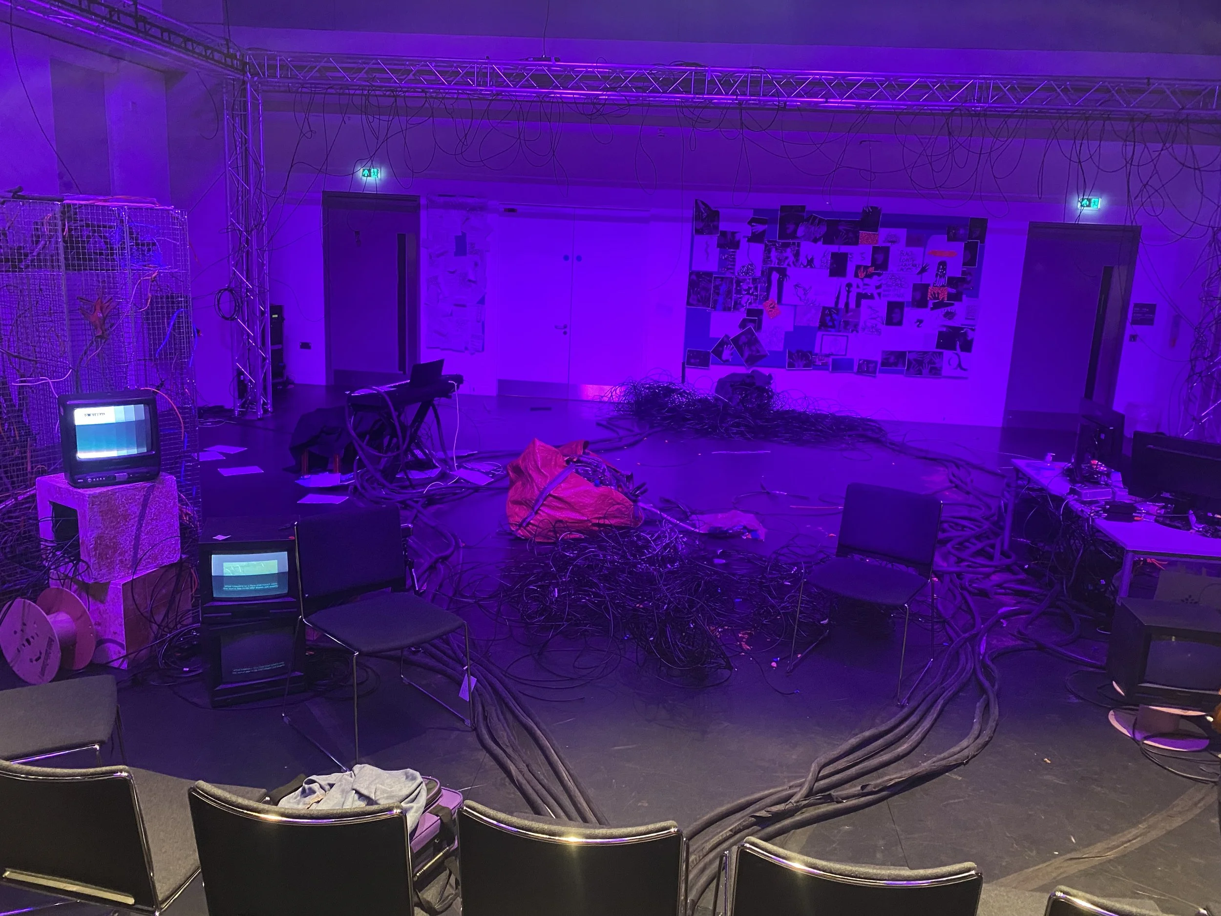
Another issue we later had was sight lines - especially after the seating configuration was changed from being at a diagonal to being straight on. Kevin commented saying that he’d like the TVs incorporated into the space more as opposed to just being at the front and we had also received feedback that the TVs were set too low on the ground to be visible. Our original design had included rostrum so we went back to that and additionally placed the TVs near “action points” the audience would already be drawn to during the piece - creating more dynamic levels with our set in the process. We put Alicia’s live stream TV and 2 CRT monitors on one, Jake’s piano and another CRT. We moved another CRT so it would be on Chris’ desk, raising the sight level.
With all the changes made, our final set looked like this: